Screen layouts
Build screens that allow users to complete various actions in the content area. Before designing individual screens, make sure you define the navigation and how the screens will flow together.
How to choose a screen type
In Customize, a screen is any surface that can contain components. Screens can fill all or part of the content area and can be layered on top of each another.
Anthem uses three types of screens:
- Standard screens: Standard screens fill the entire content area. This is the screen type you use most often.
- Panels: Panels allow the user to do or view something quickly without losing access to the content area. Panels display on top of a standard screen and are located on the right.
- Dialogs: Dialogs intentionally draw the user's focus and should be used as a final checkpoint for significant actions (e.g. actions that can't be undone). Dialogs display on top of a standard screen and are located in the center.
Standard screens
Standard screens fill the entire content area. All tasks that users perform in the content area should start and end on a standard screen.
Best practices
- Users should always land on a standard screen after selecting an item in the side menu (e.g. an experience task below Do).
- You can provide navigation on standard screens so that they flow together (i.e. users can move from one standard screen to the next within the same experience task). You can also launch panels and dialogs within standard screens.
- Leverage the standard screen layouts. The layouts help ensure consistency from one screen to the next across the Opus Platform.
- Be mindful of the user's primary intent when designing a standard screen. Consider what the user is trying to do within the context of the experience task to ensure that you are providing relevant information and actions that help the user complete their intent.
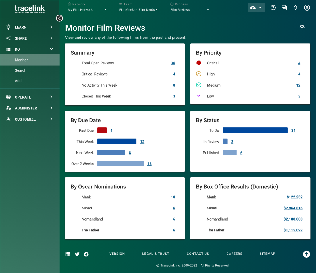
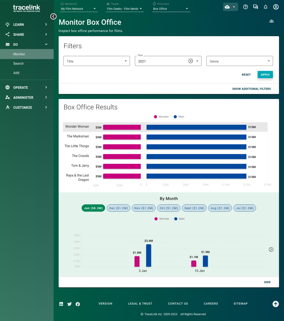
Operations dashboard
Use the operations dashboard layout to help users quickly absorb critical information related to their intent. When included in an experience task, you should use an operations dashboard in the landing experience.
The operations dashboard gives users a summary of information at a glance (e.g. total number of errors). It's most helpful for frequent users that perform routine business functions (e.g. resolving incidents that are assigned to them). When choosing information for an operations dashboard, consider which data points will be most helpful to the user to accomplish the intended task. The purpose of the operations dashboard is to surface relevant and useful metrics for users to take action on.
Component usage
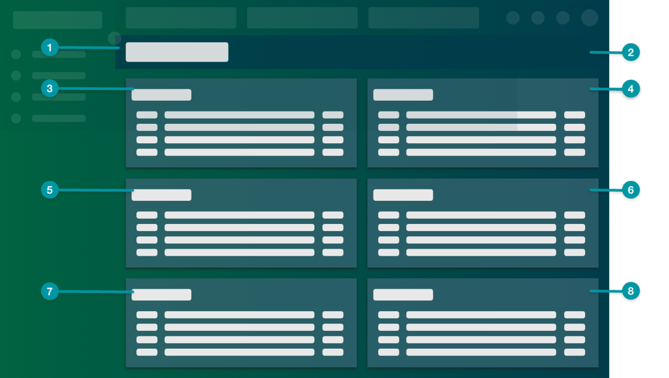
- Screen Header
- Toolbar (optional)
- Summary Chart
- Summary Chart (optional)
- Summary Chart (optional)
- Summary Chart (optional)
- Summary Chart (optional)
- Summary Chart (optional)
Example
Analytics dashboard
Use the analytics dashboard layout to provide complete data that users can explore in order to make complex business decisions. When included in an experience task, you should use an analytics dashboard in the landing experience.
The analytics dashboard takes data from disparate sources and puts it next to each other to reveal patterns that users might not otherwise see. Unlike the operations dashboard, which provides quick answers to simple questions, the purpose of the analytics dashboard is for users to explore data and draw conclusions. The analytics dashboard is most helpful for business users that rely on metrics to make informed decisions.
Component usage
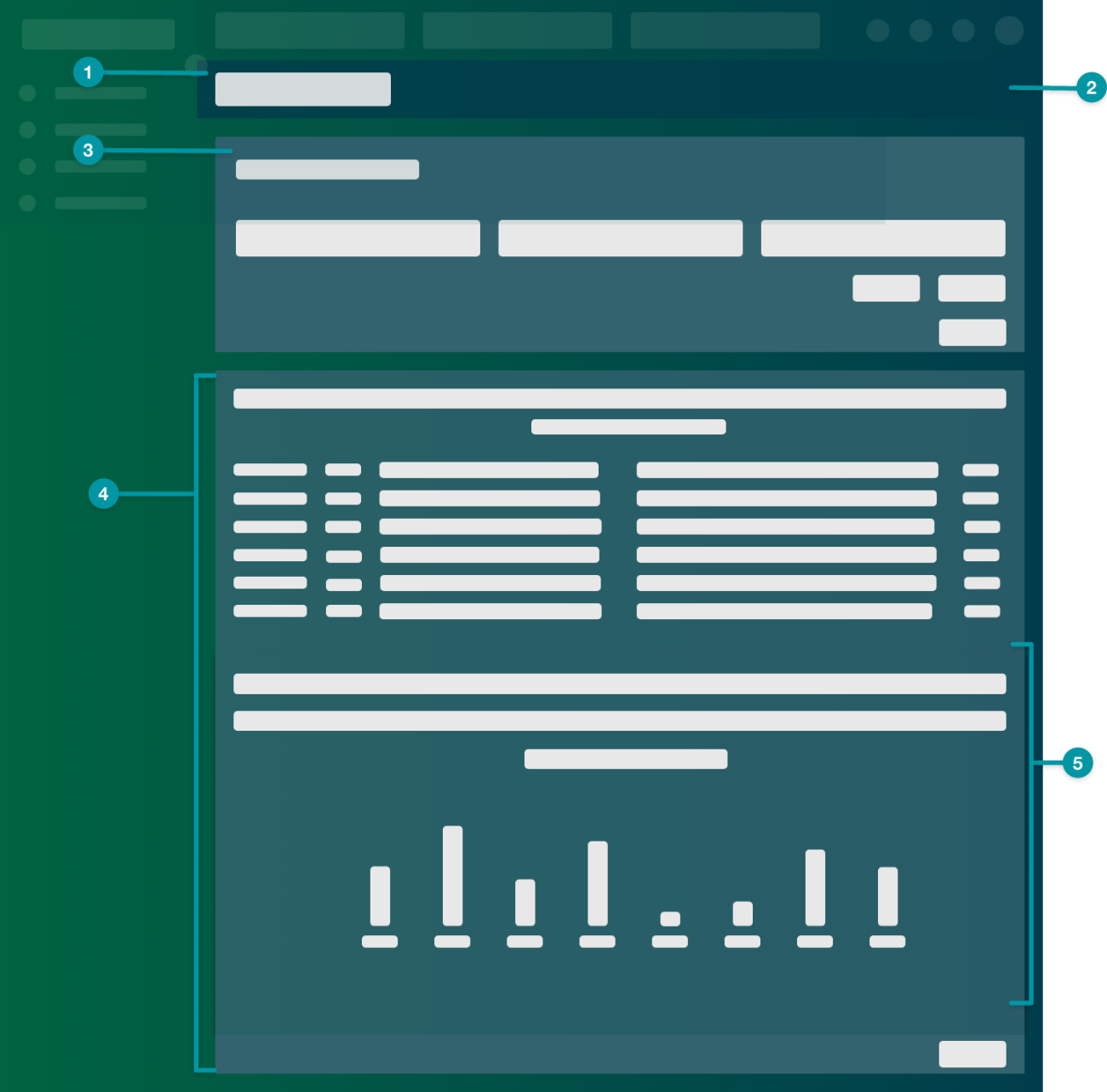
- Screen Header
- Toolbar (optional)
- Filter Panel
- Bar Chart or Butterfly Chart
- Button, which shows or hides the Timeline Chart, configured using the emitted event.
- Timeline Chart
Example
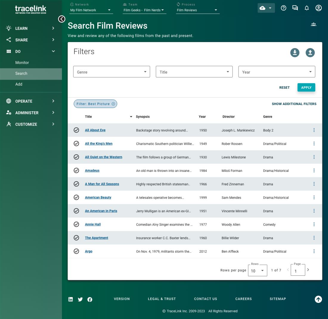
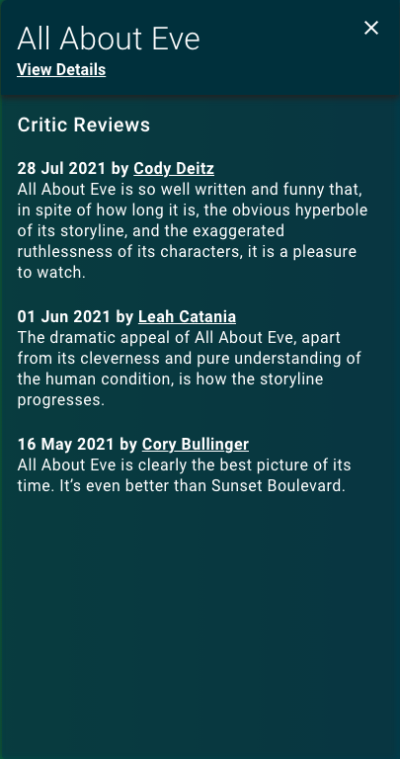
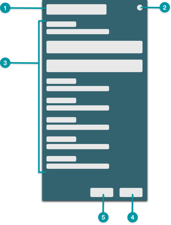
Results table
Use the results table layout to expose large amounts of data to the user in text form and to allow users to filter for specific values. Results tables can be used in the landing experience for an experience task.
Component usage
- Screen Header
- Toolbar (optional)
- Filter Panel
- Table View
- Shown with configured (optional).
Example
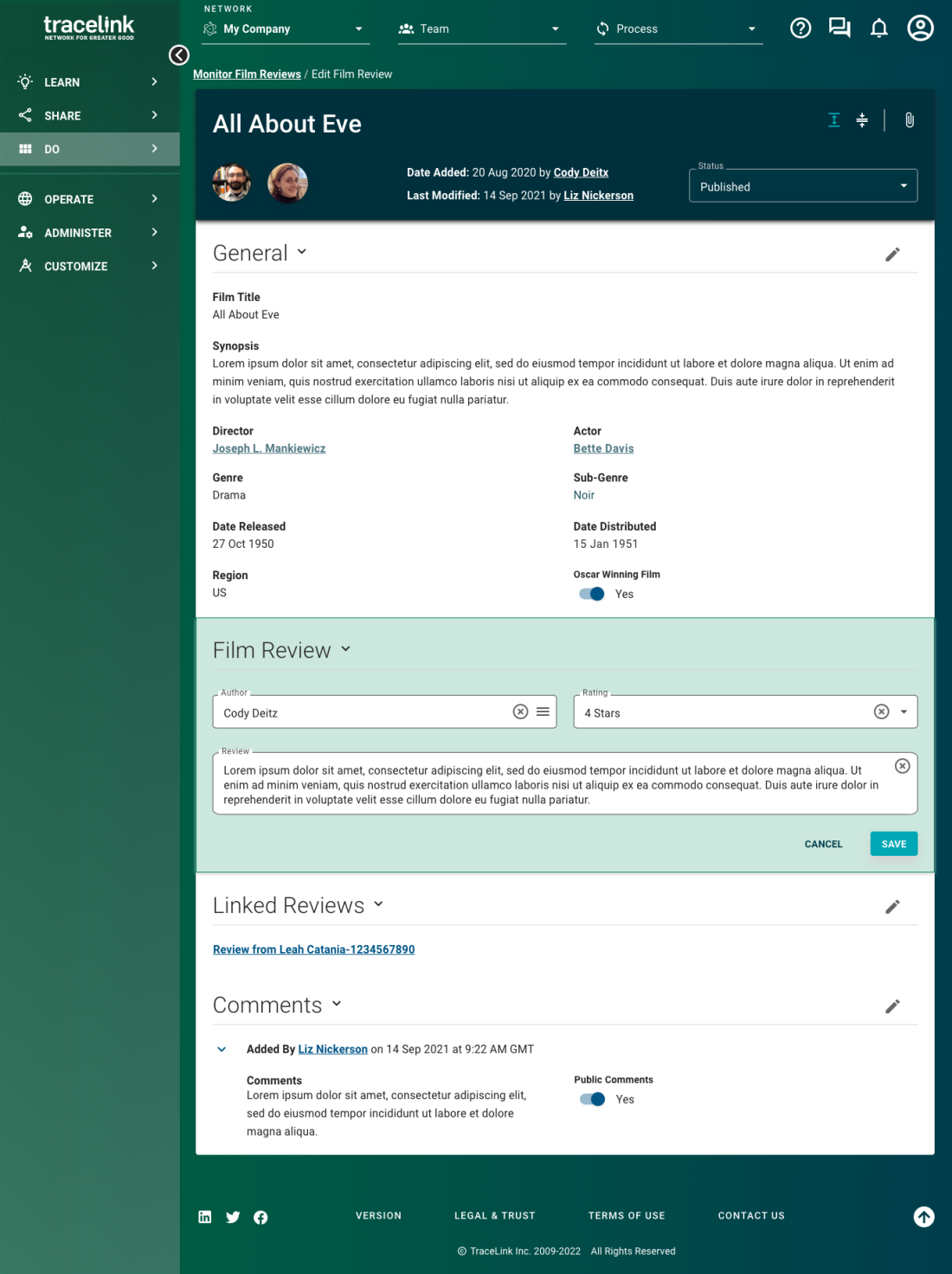
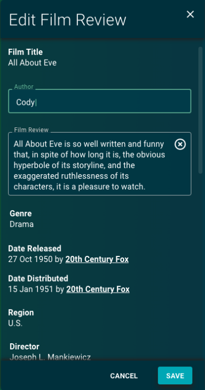
View and edit
Use the view and edit layout to display existing form data. Display the form in view mode first, and provide users with an edit action on the screen.
The view and edit layout often displays large amounts of information, so leverage layout components and typography best practices to organize the screen and make it easy for users to scan for the information they need.
 Panels using the quick view layout often lead to a standard screen that uses the view and edit layout.
Component usage
- Screen Breadcrumb
- Screen Header
- Toolbar
- Formatted Content (optional)
- set to User Avatar Display Treatment.
- Formatted Content (optional)
- set to Formatted Text Display Treatment.
- Workflow Transition (optional)
- Action Form
- set to View and Edit.
Example
Add
Use the add layout to allow users to complete long forms.
The add layout should be used only if the add action has more than 7 steps. If the add action has fewer than 7 steps, use a panel with the action layout instead.
Use the view and edit layout to allow users to edit the objects they add later.
Component usage
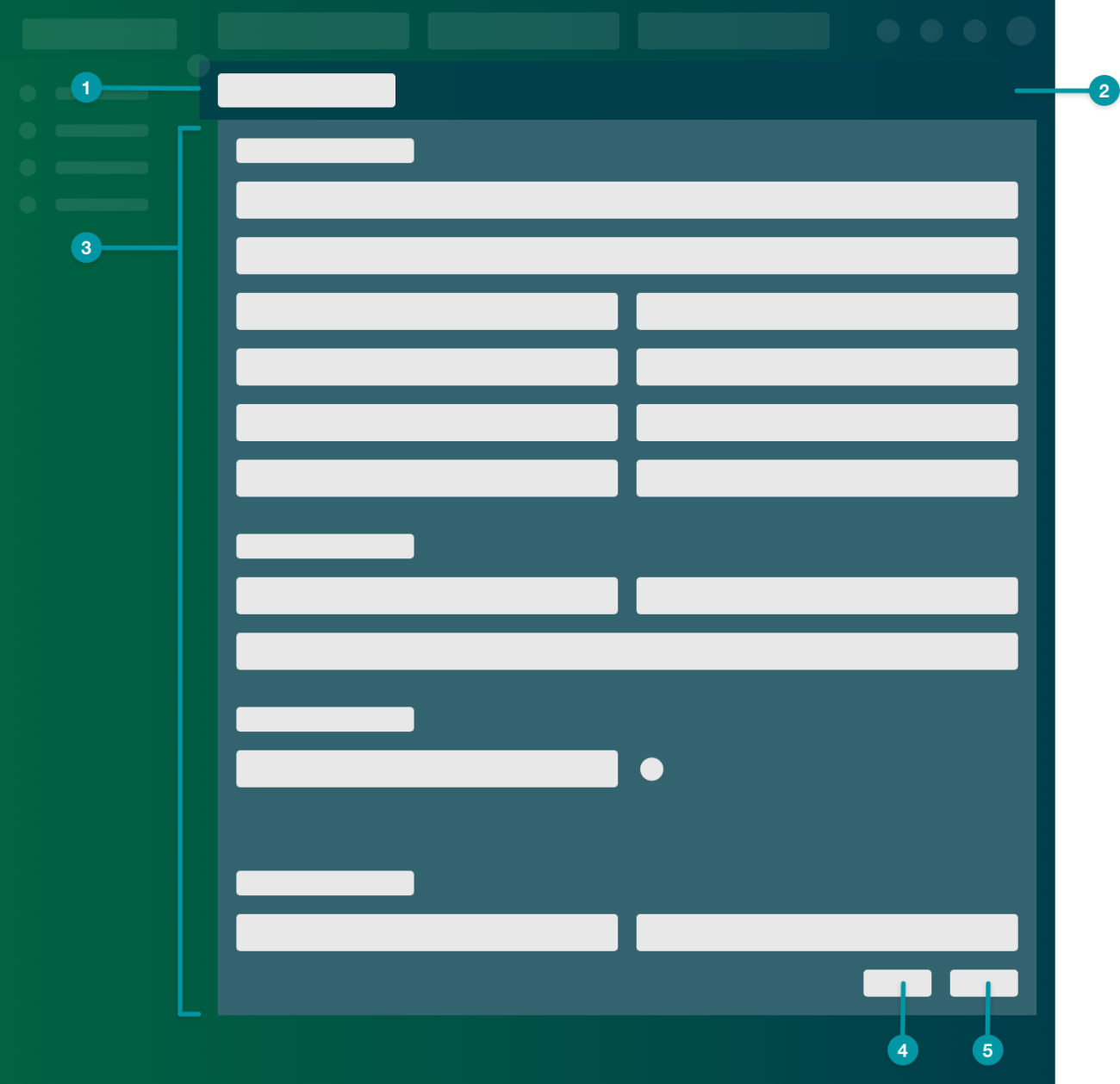
- Screen Header
- Toolbar
- Action Form
- set to Add.
- Button
Secondary Cancel button.
- Button
Primary Add button.
Example
Panels
Panels display on top of a standard screen and are located on the right. When the panel is displayed, users can still interact with the standard screen behind the panel, and the panel closes only when the user selects the Close icon.
Use a panel to allow users to do something quickly without losing access to the content area. The purpose of the panel is to provide efficiency without disruption. The panel enables users to view small amounts of information or take simple actions without abandoning what's already in front of them on the standard screen. If the user still needs the information on the standard screen to complete their intent, use the panel.
The panel adds some movement to the screen, which brings a little bit of delight for the user.
Best practices
- The information in the panel should be related to the intent for the standard screen that the panel is launched from.
- Use a panel with the action layout for actions that have fewer than 7 steps. If the action has more than 7 steps, use a standard screen instead.
- Avoid using panels to display large amounts of information. If the panel becomes hard to read, consider using layout components within the panel to make the information easier to scan, or display only the most useful information in the panel and link to a standard screen with all of the information.
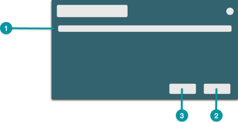
Quick view
Use the quick view layout to display slightly more information than is available on the standard screen that the panel is launched from.
The quick view layout is useful for supplementing the information on the standard screen with a few pieces of extra, related information. If there is more information that might be meaningful to the user, but isn't directly related to the user's intent, include this information on a standard screen with the view and edit layout, and link to the standard screen from the panel.
The Toolbar along the bottom of the panel provides left and right arrows that allow users to scroll through the information.
Component usage
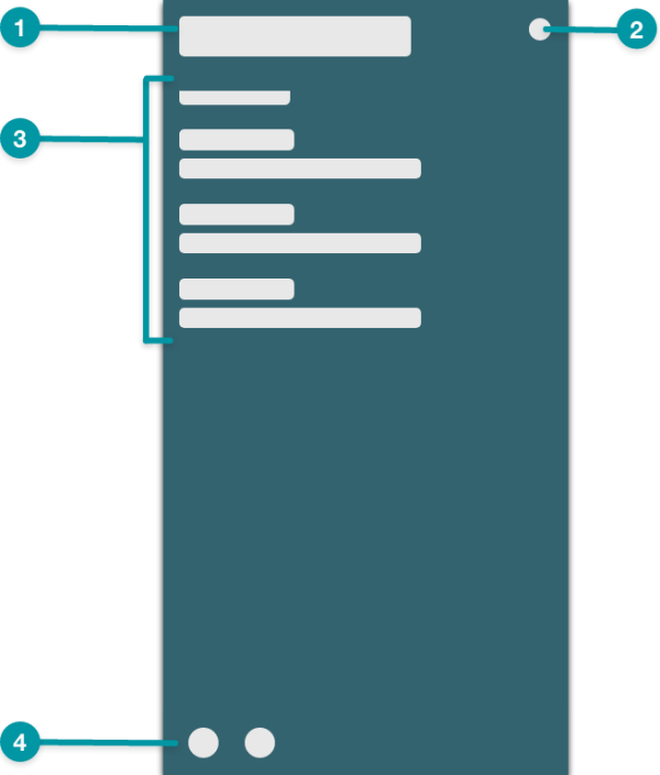
- Screen Header or Formatted Content
- Toolbar
- Action Form
- set to View and Edit.
- Toolbar
Example
Action
Use the action layout for simple actions that have fewer than 7 steps. If the action has more than 7 steps, use a standard screen instead.
The action layout allows users to quickly complete actions without losing access to the standard screen that the panel is launched from. Use the appropriate icons and language for common actions (e.g. add, edit).
Component usage
- Screen Header or Formatted Content
- Toolbar
- Action Form
- set to Add.
- selected. Unlike the add screen layout where the Button components are optional, Buttons are required in panels with the action layout.
- Button
- Secondary Cancel button.
- Button
- Primary Add button.
Example
Dialogs
Dialogs display on top of a standard screen and are located in the center. Users can't interact with the standard screen behind the dialog while the dialog is displayed.
Use a dialog as a final checkpoint for significant actions (e.g. actions that can't be undone). The purpose of the dialog is to intentionally draw the user's attention, allowing the user to pause and focus on the implications of the action they're about to take. Because the dialog requires focus, use it carefully and with intention.
Best practices
- Always use a dialog to confirm actions that can't be undone.
- Users must intentionally choose to close a dialog, so provide a Cancel button along the bottom of the dialog in addition to the Close icon in the upper right.
- Keep the text content in the dialog concise to avoid scrolling.
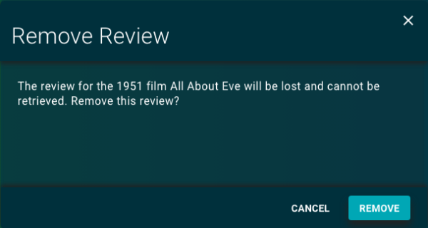
Confirmation
Use the confirmation layout to provide users with a final checkpoint for significant actions (e.g. actions that can't be undone). State the implications of the action that the user is about to take using clear, unambiguous language.
Component usage
The dialog screen type provides the dialog title and Close icon by default.
Example