Iconography
Icons are visual representations of statuses, actions, and more.
Use purposeful, meaningful icons to provide a visual metaphor, which can maximize comprehension, reduce cognitive load, and transcend language barriers.
Best practices
- Always use labels to provide alternate text for accessibility. We provide default labels, but you should always try to be specific to your situation.
- Use the same style of icons in the same place (e.g. do not mix an outlined icon and a filled icon in the same row of icons within a table).
- Use Cyan for filled icons that represent primary actions and Cobalt for icons that represent secondary actions. See Color for more information.
- Avoid using more than two colors within a group of icons. Only the primary action icon should be in a different color.
Standard icons
The following sets are the most common icons for anthem. Always use these icons for the purpose defined here. If you need icons for decorative purposes, do not use these.
 Objects represent the business objects within the app that your experience is for (e.g. film reviews).
Actions
Action – Displays the Action menu that allows users to take multiple actions.
Add – Adds a new object.
Attach – Attaches a file to an object.
Copy – Copies the object.
Edit – Opens the edit mode for an object or specific attributes on an object.
Export – Exports a CSV or PDF of data.
Import – Imports a CSV file of data to add, edit, or remove data.
Remove – Removes the object.
Save – Saves the information about the object.
Search – Searches data based on keywords.
Share – Shares the object and its data with other entities on the TraceLink Network.
View – Views the details of the object.
Statuses
Archived – The object has been archived.
In Progress – Something is in progress.
Not In Use – The object is not currently being used.
Pending – The object or action is pending something else happening.
Read – The object has been opened and viewed.
Success – The action was successful.
Success – The action was successful.
Unread – The object has not been opened or viewed.
Navigation within the Toolbar
Collapse All – Collapses all sections within the screen that can be collapsed, typically used on screens with Action Forms.
Dashboard View – Switches the user's view of the data to a screen that displays a dashboard.
Expand All – Expands all sections within the screen that can be expanded, typically used on screens with Action Forms.
Table View – Switches the user's view of the data to a screen using Table View.
Choosing icons
The full set of standard icons for anthem can be downloaded from Resources. If you need an icon beyond these standard options, choose from the Google Material icon set.
Styles
Anthem icons come in 2 different styles that can be used in different contexts. These styles should not be mixed within the same context. For example, within a group of action icons in a Table View component, you should use all outlined icons.
Do
Use the same style of icon within the same context.
Don't
Don't use a mix of outlined and filled icons in the same place.
Outlined
We use outlined icons within most data display components. For example, status icons within the rows of a Table View and action icons within Action Cards.
Filled
Filled icons are the default style, so they're used in most places, including the action icons at the top of a Table View component.
Sizes
Components predetermine the correct size of icon depending on the placement within the component. Icon sizes can't be customized by Solution Developers.
Small16x16 pixels Small icons are used in specific situations that require attaching an icon to a field. In general, this icon size is too small and should be avoided unless absolutely necessary. |
|
Medium24x24 pixels Medium icons are the default size, and are used anywhere else not mentioned here (e.g. table rows, toolbars, section actions). |
|
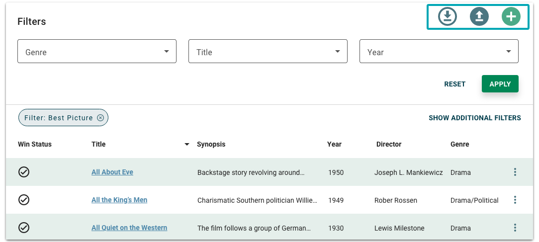
Large32x32 pixels Large icons are used for table actions in the Table View component (e.g. add, import, export). |
|
Extra large40x40 pixels Extra large icons are used for screen-level actions on a dashboard screen (e.g. add, import, export). |
|
Using color with icons
Icons can be used in a single color. Use the semantic colors to demonstrate priority or status, or change the color of a single icon to emphasize it.
Do
Change the color of the primary action in a line of icons to bring the user's attention to it.
Don't
Don't use more than two colors in a line of icons.
Follow the guidelines for using the anthem colors if you change the color from the default, which is #666666. The disabled state is #BDBDBD. Make sure the colors you use are easily distinguishable from the default and disabled states.


