Table View
Table View provides a table that displays one object in the system per row, automatically paginating if the number of objects exceeds available space. All of the table rows display objects from the same query, and each row is expandable to display more information. Users can search the objects in the table and take actions on these objects.
- Usage
- Configuration
- Examples
The Table View organizes system objects into a table of rows and columns, combining the ability to display large sets of data about a specific item with the ability to take action on an item without going to another screen. The Table View component also allows users to take action on multiple items at once.
Table View is best for screens that need to represent a large number of items in the system that can be searched or filtered (e.g. a film database where each film has a lot of attributes users can filter against).
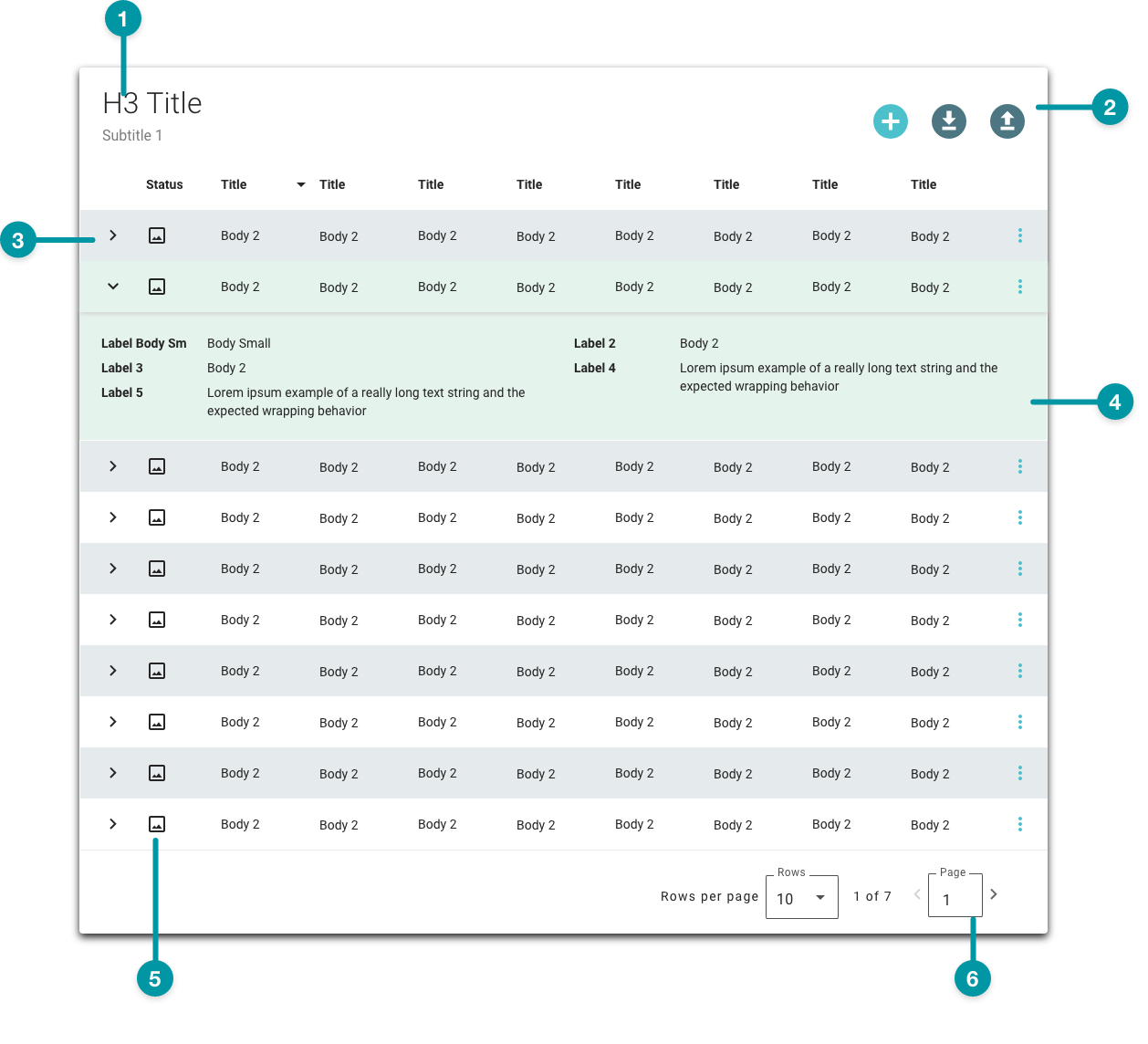
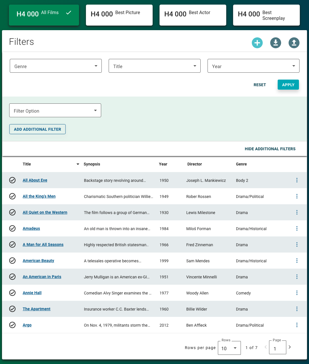
Anatomy
-
Table title
-
Table actions
-
Expand row arrow
-
Row action
-
Row status icon
-
Table page
Best practices
- Configure Table View as an extra large component, and no smaller than medium, on the grid. Use a size that displays all items in the table when the screen loads.
- If you have multiple tables with the same columns, place those columns in the same position in all tables (e.g. always position a "Status" column first).
- Position primary actions users can take to the right side of the row.
- The ideal number of columns is 5 to 7 columns, including columns for icons and actions. Don't exceed 10 columns total.
- Keep column labels concise and consistent between tables. Follow the Writing guidelines.
- When a user selects a row, display context about a specific aspect of a row's content by adding a quick view panel.
-
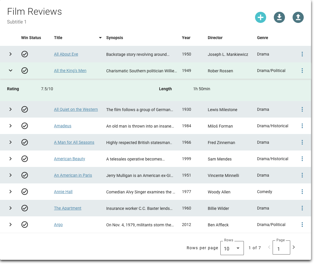
Use a table row expansion to provide additional context to the row that is useful but not required to understand or interpret the row. Ideally, include only 3-5 additional values in expansions.
-
Use groups in a row expansion only when absolutely necessary, as these can clutter the expansion. Include no more than 5 groups where there 3 to 5 items per group.
Do
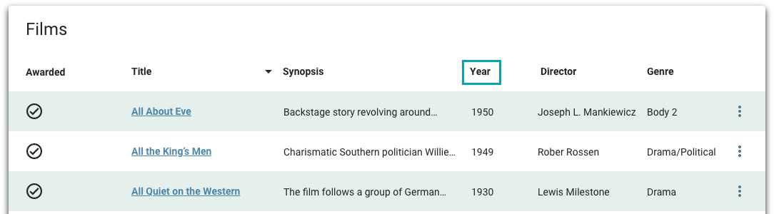
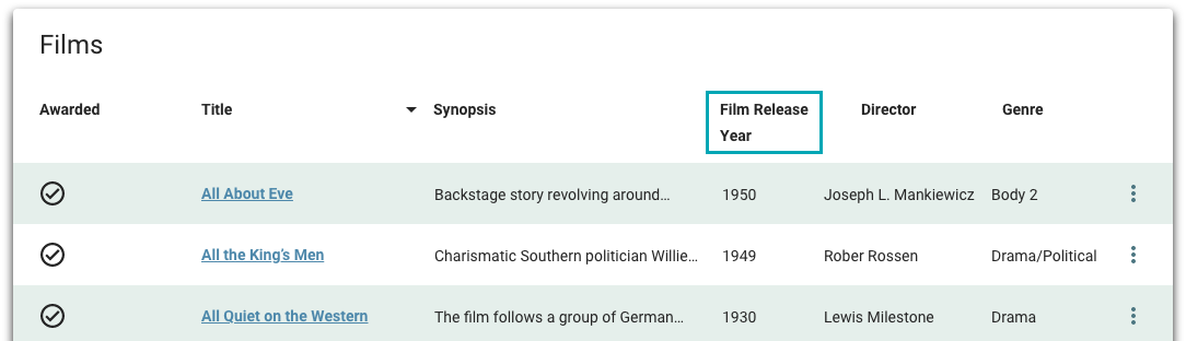
Write clear and concise column labels.
Don't
Don't write overly long column labels.
Common patterns
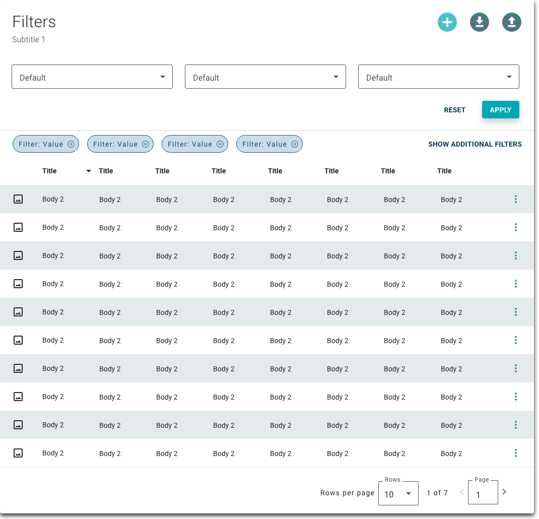
With filter
Configuring the Table View with a Filter Panel to allow filtering allows users to easily pare down large data sets and more closely examine particular objects in the data set.
With Facets
Facets, like configuring the filter property, allow users to quickly filter data to examine particular objects in the Table View.
Properties
- checkbox – Optional. If selected, a card background is applied to the table, which sets the component apart from the screen background. If not selected, the default screen background displays.
- field – Required. The number of rows to display when the screen loads. Defaults to 10.
- section – Optional. A section of properties used to configure the actions available at the top of the table, which allow users to interact with the whole data set displayed in the table (e.g. add a new item, download items):
- field – Optional. The hover text that displays for the action icon.
- field – Optional. The UI icon that displays for the action.
- field – Optional. The API called when the user selects the action icon.
- checkbox – Optional. If selected, the action is disabled if there is no data available in the table.
- field – Required. The query that retrieves the data for the table view, based on the data model.
- field – Optional. The initial set of conditions used when retrieving data from the source specified in the field.
- field – Optional. The source of additional data when a table row is expanded.
- field – Required. The message that displays if there is no data available.
- section – Required. A section of properties used to configure the table columns, including details such as the field display order and the visual treatments used:
- field – Required. The field used as a column.
- field – Required. The order to display the columns in.
- field – Required. The label to display as the column header.
- drop-down – Optional. Specifies how to display the column value:
- None – The column value displays as read-only text, without additional treatment or formatting.
- Image Display Treatment – An image displays that relates to the item represented by the row (e.g. an image of product packaging).
- Formatted Text Display Treatment – The content displays as formatted text.
- Link Display Treatment – The content displays as link text.
- Icon Display Treatment – A UI icon displays that represents information about the item in the row (e.g. the status).
- field – Optional. A script used to customize the display treatment.
- section – Optional. A section of properties used to configure the actions that are available for each row:
- field – Optional. The label for the action.
- icon – Optional. The UI icon that displays for the action, if provided.
- field – Optional. The API called when the user selects the action.
- drop-down – Optional. Specifies whether the row action is displayed or hidden:
- Always Visible – Optional. The action always displays for all rows.
- Hidden – Optional. The action is hidden until the is met.
- field – Optional. The condition that specifies when the action is visible.
- checkbox – Optional. If selected, a field displays above the table, which allows users to search for specific items using keywords from the table.
- checkbox – Optional. If selected, a Filter Panel displays above the table, which allows users to filter the data in the table.
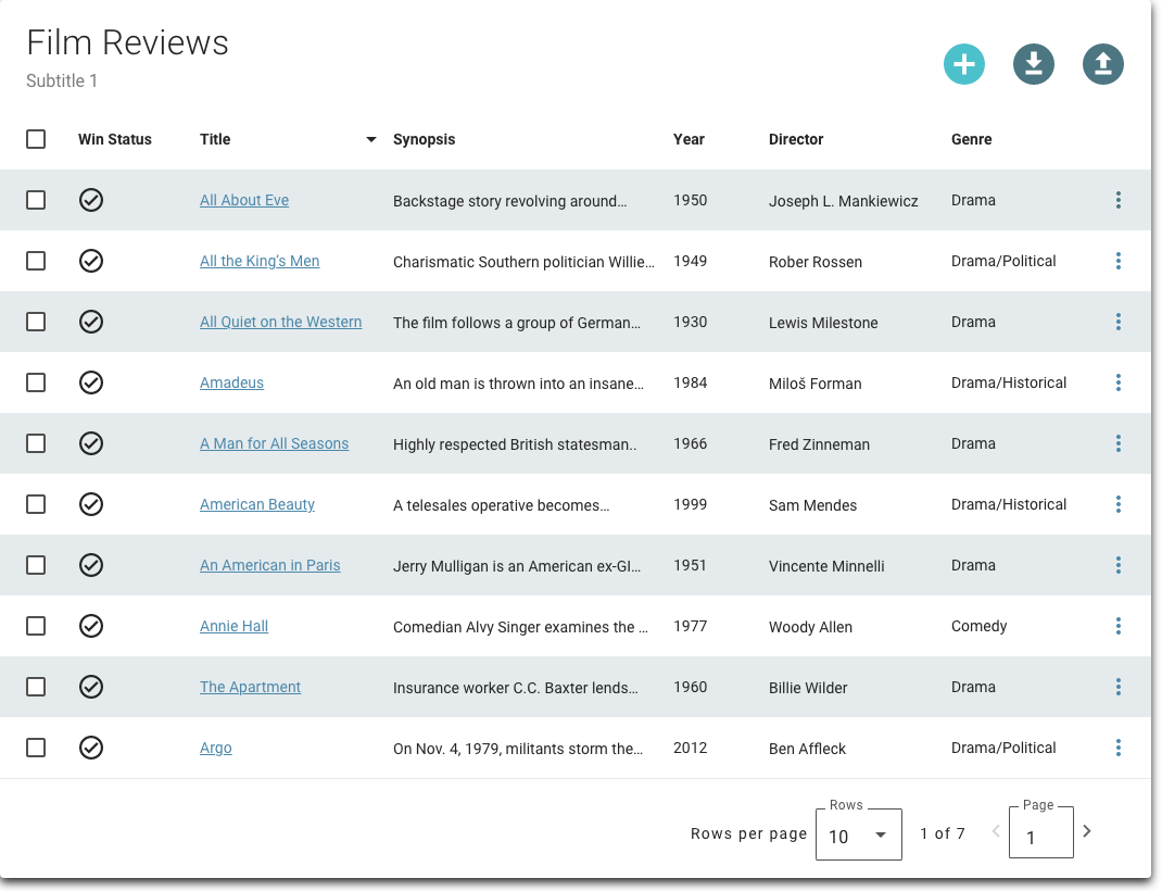
- checkbox – Optional. If selected, a checkbox displays on each row that allows users to select and execute actions on multiple rows.
- checkbox – Optional. If selected, users can expand rows to view additional information.
- field – Optional. The label that displays in the search field.
- field – Optional. The text that displays in the field search button.
- checkbox – Optional. If selected, the fields that display when the rows are expanded display in groups.
- checkbox – Optional. If selected, users can collapse and expand groups within expanded rows. Groups display in a collapsed state when the row expands.
- checkbox – Optional. If selected, group headers are hidden in the expanded rows.
- section – Conditionally required if the checkbox is selected. A section of properties used to configure groups within expanded rows, including the fields that belong to the group and whether the groups are visible:
- field – Optional. The label that identifies the group.
- section – Optional. The fields to include in the group.
- field – Optional. The field to include in the group.
- field – Optional. The label that displays for the field.
- drop-down – Optional. Specifies whether the section is displayed or hidden for all rows:
- Always Visible – Optional. The group always displays for all rows.
- Hidden – Optional. The group is hidden unless visibility conditions are met.
- field – Optional. The condition that specifies when the group is visible.
- checkbox – Optional. If selected, a Download icon displays at the top of the table and users can download data from the table using the File Download component.
- checkbox – Optional. If selected, data in the expanded display is sourced from the same source specified in .
- checkbox – Optional. If selected, columns that contain no data display on the screen ( "--" displays if no data is available).
- field – Optional. The user's permission to access the component. If a user is not assigned a role that includes this permission, they cannot view or interact with the component.
- drop-down – Optional. If the user does not have permission to access the component, specifies whether to hide or disable it:
- Hide – The component is hidden.
- Disable – The component is visible but not cannot be interacted with.
Emitted events
- – The user selects the row.
- – The user applies a table filter.
- – The user performs a row action, invoking the relevant API configured by the Solution Developer.
- – The user performs a table action, invoking the relevant API configured by the Solution Developer.
Functions
- – When invoked in an event, selected query conditions are applied to the data set.
- – When invoked in an event, information about the selected rows is retrieved.
- – When invoked in an event, currently applied query conditions are retrieved.
With row expansion and row actions
- :
- included.
- included.
- included.
- :
- set to Link Display Treatment for Title column.
- :
- included.
- included.
- included.
- set to Always Visible.
- not selected.
- not selected.
- not selected.
- selected.
- not selected.
With row multi-selection and row actions
- :
- included.
- included.
- included.
- :
- set to Link Display Treatment for Title column.
- :
- included.
- included.
- included.
- set to Always Visible.
- not selected.
- not selected.
- selected.
- not selected.
- not selected.


