Facets
Facets are chips that provide a quick way for users to filter and refine search results, allowing them to better understand large sets of data.
- Usage
- Configuration
- Examples
Facets enable users to quickly filter search results or other data using broad, high-level categories, allowing them to better understand that data (e.g. a list of films might have facets to filter the films by release year or genre). While facets are not designed to filter data in great detail, they are powerful because they allow users to quickly apply different filters to a data set, such as narrowing down a list of films by selecting the year, genre, or director.
Anatomy
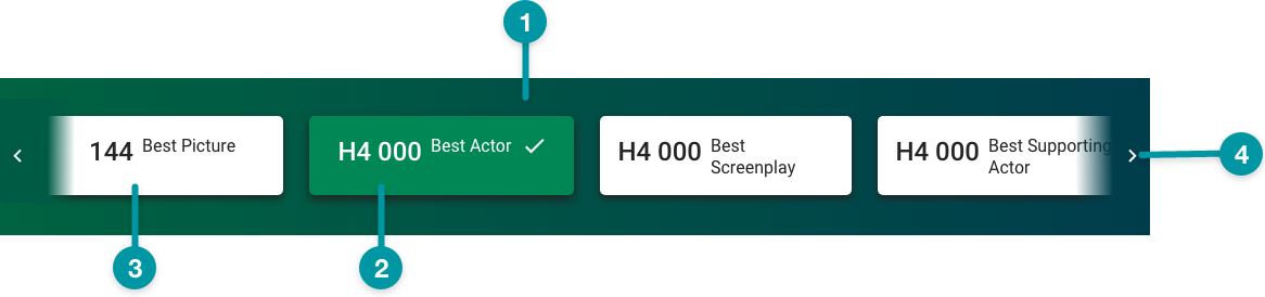
-
Card background
-
Facet (selected)
-
Facet
-
Next icon
Best practices
- Use facets to filter large sets of data, and always within a component that queries data (e.g. Table View).
- Use facets to filter summarized or rolled-up data (instead of raw data).
- Configure Facets as extra large components, and no smaller than medium, on the grid.
- Include an option to view all of the available data.
- Consider using facets in place of a dashboard if the data displayed isn't complex enough to warrant a dedicated dashboard.
- Keep facet text concise with clear distinctions between categories.
- Use facets to filter only the data available on-screen at that moment. Don't not filter data that links out to another screen.

Do
Write clear, concise Facet labels that are distinct from one-another.

Don't
Don't write Facets with minor, nuanced differences.
Common patterns
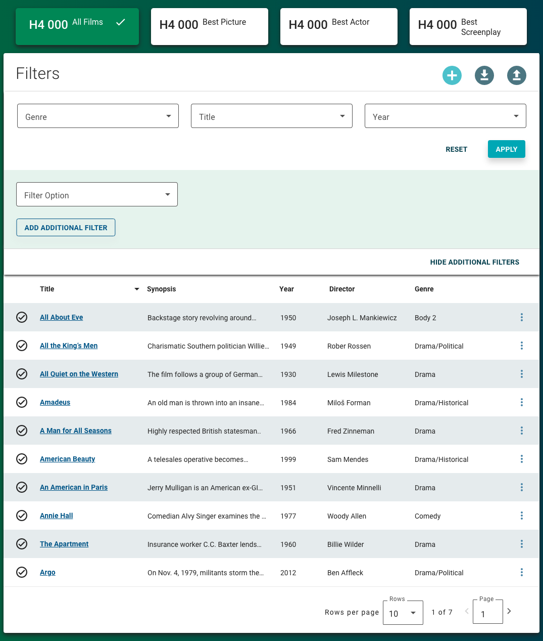
With Filter Panel and Table View
Facets complement the Filter Panel by adding a high-level dimension to filter content, especially content in the Table View.
Properties
- checkbox – Optional. If selected, applies a card background to the facet, which sets the component apart from the screen background. If not selected, the default screen background displays.
- section – Required. A section of properties used to configure the facet.
- field – Required. The label that displays on the facet.
- field – Required. The query that retrieves the data for the facet based on the data model. The data retrieved from this source includes the number of results, which displays on the facet.
- field – Optional. The user's permission to access the component. If a user is not assigned a role that includes this permission, they cannot view or interact with the component.
- drop-down – Optional. If the user does not have permission to access the component, specifies whether to hide or disable it:
- Hide – The component is hidden.
- Disable – The component is visible but not cannot be interacted with.
Emitted events
- – The user selects a facet.
Functions
- – When invoked in an event, the facet name and number of results are retrieved.
With three facets
- selected.
With scroll

- selected.
 When the number of facets exceed available screen space, scroll arrows are automatically added to allow users to navigate through the whole list.

