Grid
The grid organizes the content area of the screen. It's a structured yet flexible design framework that lets you create a variety of layouts with consistent spacing, scale, and positioning across screens.
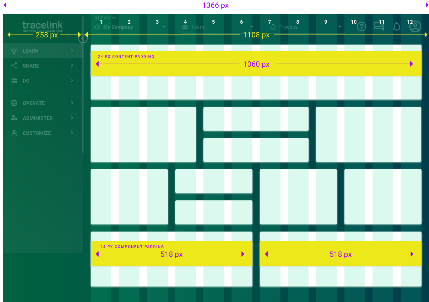
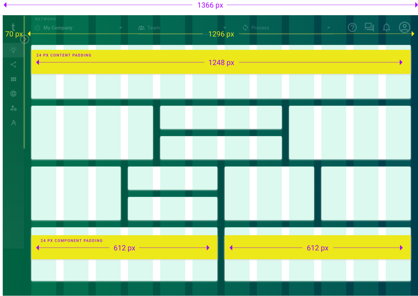
Anthem uses a 12-column flexbox grid.
 The anthem grid isn't customizable (i.e. grid dimensions are predefined). It only applies to the content area of an anthem screen. It can't be used to modify the
 Elements
The grid is made up of a series of columns (A) separated by fixed-width gutters (B) and margins (C). You add your content by placing components on the grid. 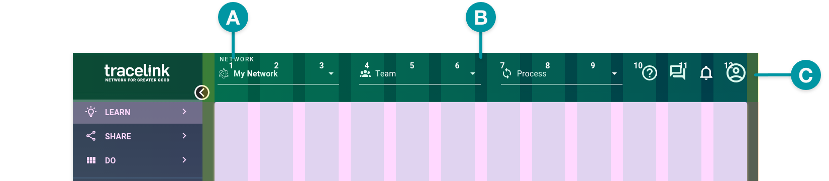
Columns
Columns contain and position your content across the width of the grid. Components can span multiple columns, but they must start and end at a column.
The anthem grid contains 12 columns.
Gutters and margins
Gutters and margins provide fixed-width spaces on the grid.
- Gutters — The spaces between columns that separate content on the grid. Components can cross gutters.
- Margins — The spaces on the left and right of the content area. Components can't cross margins.
Components
Components are positioned on the grid by specifying the row, starting column, and ending column.
 Components also have their own interior grid used for design and positioning of interior elements. It is separate from the main screen grid and can't be modified.
 Padding
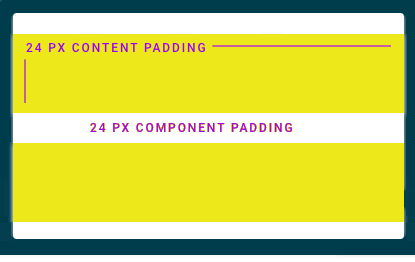
Padding provides automatically applied whitespace between elements. It's predefined and can be measured vertically and horizontally.
There are two types of padding:
- Component padding — Separates components on the grid.
- Content padding — Separates content within a component from the component borders.
Grid width
The Opus Platform supports collapsible UI elements and components to show or hide content (e.g. expandable rows in a Table or sections in an Action Form).
The side menu of every Opus screen can be collapsed and expanded to increase or decrease the width of the content area, which affects the width of the grid and any configured components.
When the side menu is collapsed, the content area expands and the collapsed side menu is still visible:
Designing to the grid
As you're creating your screens, you'll design your layout using the grid.
Sizing
Refer to the size recommendations and best practices for individual anthem components.You can define the size of each component when you add it to a screen. However, there are suggested sizes to best suit each component (e.g. a Table View should span all 12 columns of grid).
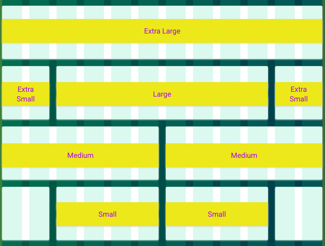
A component's size is determined by the number of columns that it spans. Anthem uses the following defined component sizes:
- Extra large – The component spans 12 columns (maximum). This is best used for components that contain a lot of data.
- Large – The component spans 8 columns.
- Medium – The component spans 6 columns.
- Small – The component spans 4 columns.
- Extra small – The component spans 2 columns.
Positioning
Rows determine the order and grouping of content on the screen. You add components to the screen by row, starting at the top of the grid, and new rows are added below as you add your content. Multiple components can be added to the same row until the maximum column span is reached.
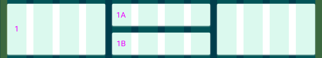
Dividing rows
You can also divide rows to better position your content.
For example, you can divide a row (Row 1) into additional sub-rows (1A and 1B) that are contained within the parent row, which can each contain their own component.
Component collages
Anthem components can also be grouped on a row to appear as a single component, or a collage. Component collages allow you to contain an interior navigation component, display charts with multiple points of data, or add Horizontal Tabs to a screen or a Toolbar to a component to allow further actions.
Component collages are positioned in the grid the same as non-collage components (i.e. select the row, starting column, and ending column). If all components have collage enabled, they display and are treated as a single component across the row. See the Customize Help Center for more information.
Collages should spans an entire row. Avoid combining a collage with another standalone component on the same row.
Best practices
- Use basic visual design principles to ensure your content is easy to understand and pleasing to the eye. For example:
- Use a Section Header to group similar components and emphasize a relationship.
- Leverage vertical alignment to indicate related content.
- Resize components appropriately. The denser the data, the larger the component should be.
- Where possible, always start with a templated layout to best align with anthem patterns. See Resources to download templates.
- Follow information hierarchy best practices and position components within the screen based on the importance of the data they contain (i.e. a component containing critical data should be placed near to the top of the screen, whereas a component with inconsequential data should be placed near the bottom).
Additional considerations
Overflow
Overflow occurs when content exceeds a defined space (e.g. the entire screen or a single component container).
- When content exceeds the screen height, vertical scroll is implemented. The vertical scrollbar displays in the content area when one or more components and their data cause the container to exceed the height of the user's visible screen (i.e. the viewport).
- When component data exceeds the container, the overflow content is indicated with visual and design elements when available (e.g. pagination, expansion, expandable links, scrolling).
Localization and internationalization
Anthem components are designed with localization (l10n) and internationalization (I18n) in mind. This includes consideration for text and label expansion, as well as:
- Support for RTL (right to left) languages.
- Support for multi-byte and glyph characters.


