Horizontal Tabs
Horizontal Tabs are tabs that align horizontally and provide internal navigation options as a means to organize information within a single screen. After navigating to a given screen using the network composer and the side menu, Horizontal Tabs allow users to access key groups of screen-level information. .
 Horizontal Tabs should not be used to navigate between screens or hierarchies.
 - Usage
- Configuration
- Examples
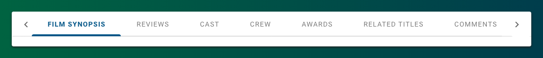
Horizontal Tabs organize content and allow users to navigate between related groups of content within a single screen. The content in each tab should be distinct from but related to the content in other tabs in the set (e.g. a screen dedicated to a film may include tabs for a synopsis or reviews of the film but shouldn't include information about a separate film). Similarly, each tab should be at the same hierarchy level within the larger context of the screen (e.g. all attributes of a single film).
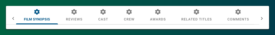
Anatomy
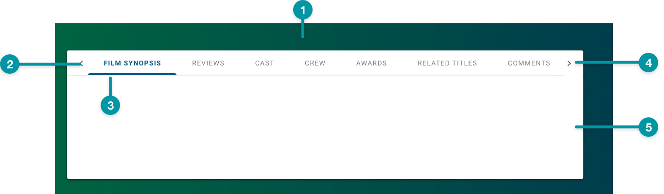
- Card background
- Tab label
- Tab border (selected)
- Overflow indicator
- Tab content area
Best practices
- Configure Horizontal Tabs as extra large components, and no smaller than medium, on the grid.
- Organize tabs so that the content of each tab is at the same hierarchical level.
- Incorporating icons with tab labels can help make the tabs visually distinct at a glance, but they risk adding clutter. Add icons to your tabs only when they help to meaningfully differentiate the tabs from one another.
- Where possible, set the content area at a consistent height across all tabs in a group.
- Keep tab labels concise and follow the writing guidelines.
Do
Provide tabs whose content is at approximately the same hierarchical level.

Don't
Don't provide tabs whose content is at varying hierarchical levels.
Common patterns
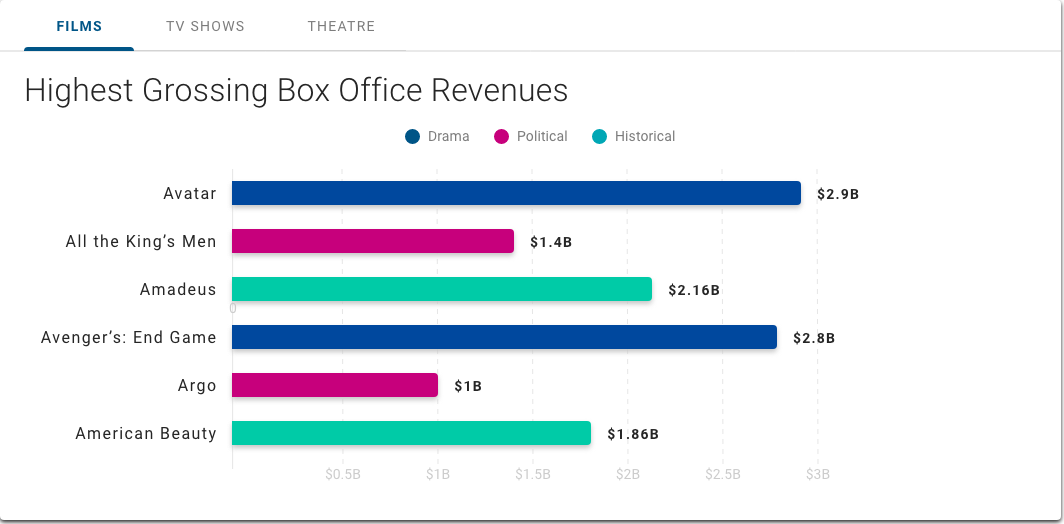
With Charts
Charts of various kinds are often included on separate tabs as an option for visualizing text content.
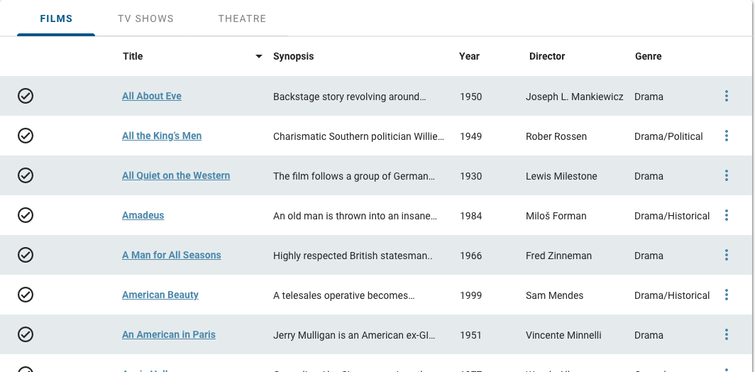
With Table View
Horizontal Tabs can provide views of related data sets, including a Table View.
Properties
- section – Required. A section of properties used to configure tabs, including the text and icon that displays:
- field – Required. The text that displays on the tab.
- field – Optional. The tooltip text that displays when the user hovers over the tab.
- field – Optional. The UI icon that displays on the tab.
- field – Required. A unique identifier for the tab item.
- checkbox – Optional. If selected, the icon displays on the tab.
- – Optional. The Configure icon displays by default if no icon is provided and the checkbox is selected.
- field – Optional. Specifies which tab is selected when the screen loads. By default, no tabs are selected when the screen loads.
- checkbox – Optional. If selected, the tab is hidden when the screen loads.
- field – Optional. The user's permission to access the component. If a user is not assigned a role that includes this permission, they cannot view or interact with the component.
- drop-down – Optional. If the user does not have permission to access the component, specifies whether to hide or disable it:
- Hide – The component is hidden.
- Disable – The component is visible but not cannot be interacted with.
Emitted events
- – The user selects a tab.
Functions
- – When invoked in an event, the selected tab displays when the screen loads.
- – When invoked in an event, the selected tab displays.
- – When invoked in an event, the data for the selected tab is retrieved.
- – When invoked in an event, the data for the selected tab is retrieved.
Label only
- :
- included.
- not selected.
- included with the first tab selected (set to
1).
Label and icon
- :
- included.
- included.
- not selected.
- included with the first tab selected (set to
1).


