Framework
To ensure consistency across all experiences on the Opus Platform, all screens share the same fundamental structure, which is defined by TraceLink's Opus Ensemble—the global user interface (UI) for TraceLink and the Opus Platform.
Opus Ensemble provides the global framework elements that display on every screen. There are four main areas within this framework:
 The framework layout can't be modified or customized.
 - Header
- Side menu
- Content area
- Footer
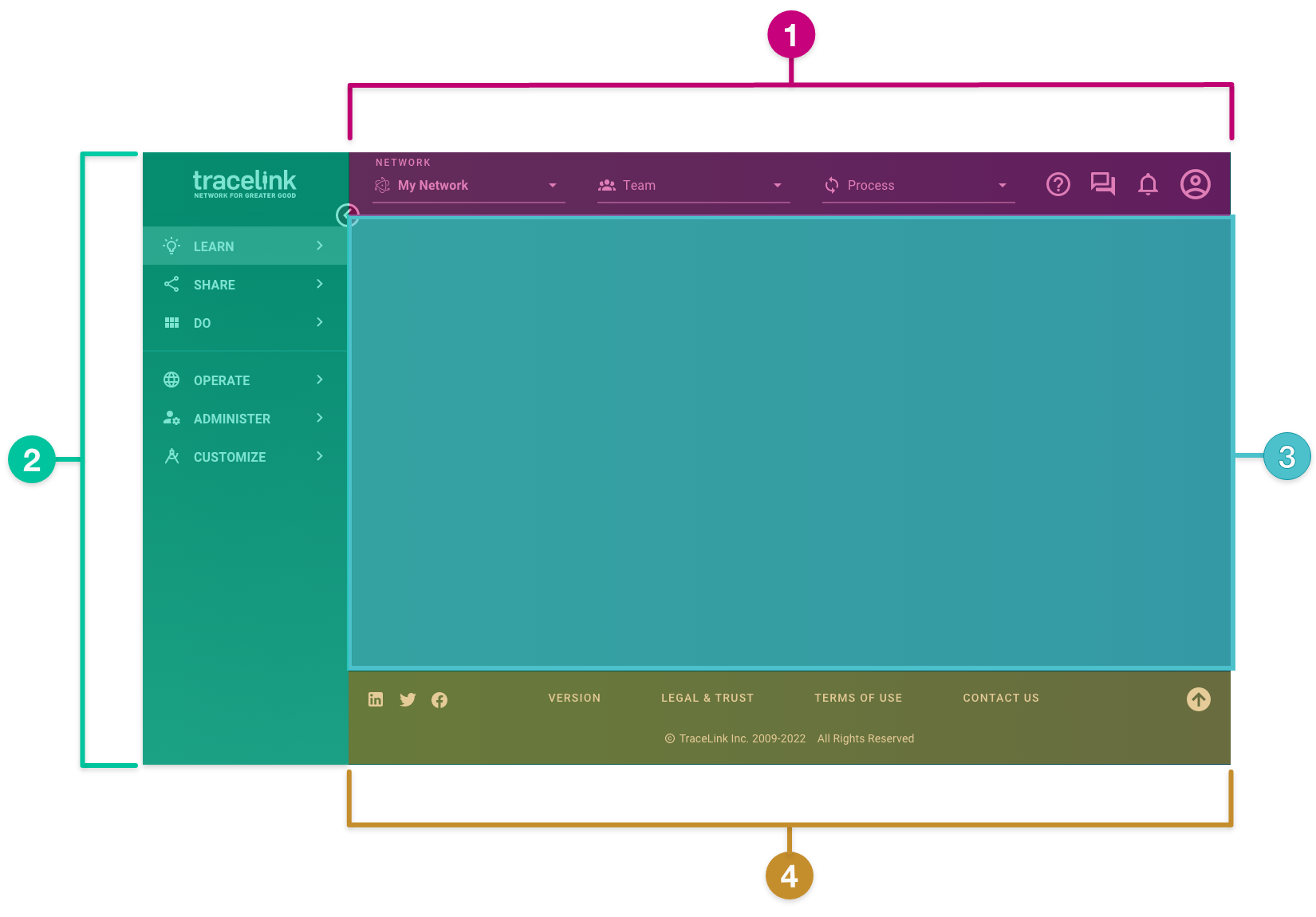
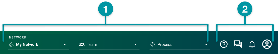
Header
The header lets authenticated users set their network context, which is the foundation of the Opus network navigation paradigm. Once the network context is defined, users will see only the app resources that are relevant to them within that context, letting them easily navigate to and accomplish their tasks.
It contains the following elements:
- Network composer
- Utilities menu
The header:
- Is a global navigation element that extends across the top of every Opus Platform screen.
- Is always available and fixed even when the user scrolls.
- Can't be collapsed, but does have responsive width.
- Can't be customized, but the networks and teams that display are defined within Administer and the processes that display are defined in the data models for each app.
The icons used in the header cannot be used for any other purpose in your experiences. See Iconography for more information.Network composer
The network composer defines the business ecosystem of the Owner and all of their linked Partners and internal locations for a specific app.
Users complete the following fields to set the network context, which determines the app resources and tasks available in the side menu:
Users won't see networks that they are members of (as an Owner or a Partner) until they log in. - drop-down — The networks the user has access to, including networks owned by their trade Partners, displayed as [Company Name] [Network Name]. Each app has at least one network, and some multienterprise apps (e.g. APT) can have multiple networks based on the specific context of the business ecosystem's goals. Networks fall into one of the following groups:
- All Networks – All networks for all apps owned by the user's company and the company's trade partners.
- My Networks – All networks for apps owned by the user's company.
- My Partner Networks – All networks for apps owned by the company's trade partners.
- drop-down — The Links that connect the Owner to their Partners and internal locations within the selected network (e.g. your entire company or a Link to a specific Partner or internal location).
- drop-down — The physical objects that teams need to take action on, which represent the business functions for the task the user wants to complete. When selected, the Do side menu displays the experience tasks associated with the process.
Utilities menu
The utilities menu provides a range of user-specific functions. It displays on the right side of the header and is always available to users.
The utilities menu displays only the Help  icon and button until the user successfully logs in.
 It contains the following menu items:
- icon – When selected, opens the Help Center for the specific network or displays a general knowledge base with access to all documentation for Opus apps, depending on the drop-down value.
-
 icon – When selected, the user's inbox displays and lets users navigate to the Inbox screen. The icon indicates the number of unread messages.
 -
 icon – When selected, the recent notifications from all apps that users have access to display. The icon indicates the number of unread notifications.
 -
 icon – When selected, a panel displays that allows users to:
- Switch to another environment they have access to (e.g. Validation or Production).
- Set their default language.
- Switch to another company, if applicable.
For more information on these menu items, see the Opus Platform Help Center.
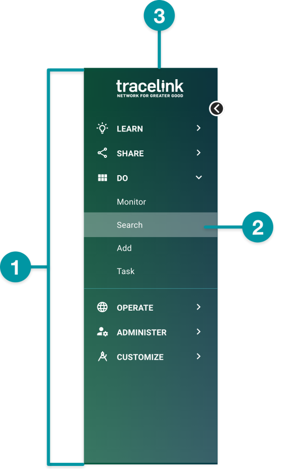
Side menu
The side menu displays navigation items, providing access to the following elements:
- Menu items
- Experience tasks
- Logo
The side menu:
- Always displays on the left side of the screen.
- Is always available.
- Is collapsible to increase the width of the content area (see Grid width for specific dimensions).
- When the side menu is expanded (default):
- When the side menu is collapsed:
- When the side menu is expanded (default):
Menu items
Menu items in the side menu display depending on the user's role and permissions within their company:
- — Always displays. Provides access to a broad range of content about the Opus Platform, including educational product offerings and a knowledge base containing additional training and support resources.
- — Always displays. Provides information on apps, service products, and app customization provided by TraceLink and third-party development partners, as well as access to TraceLink Community and global events.
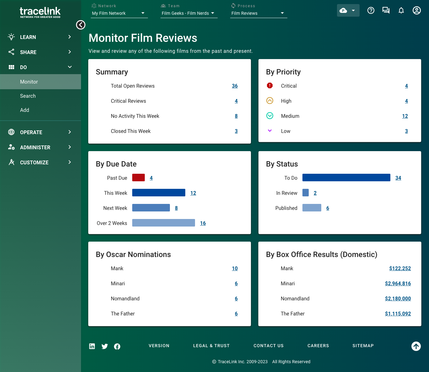
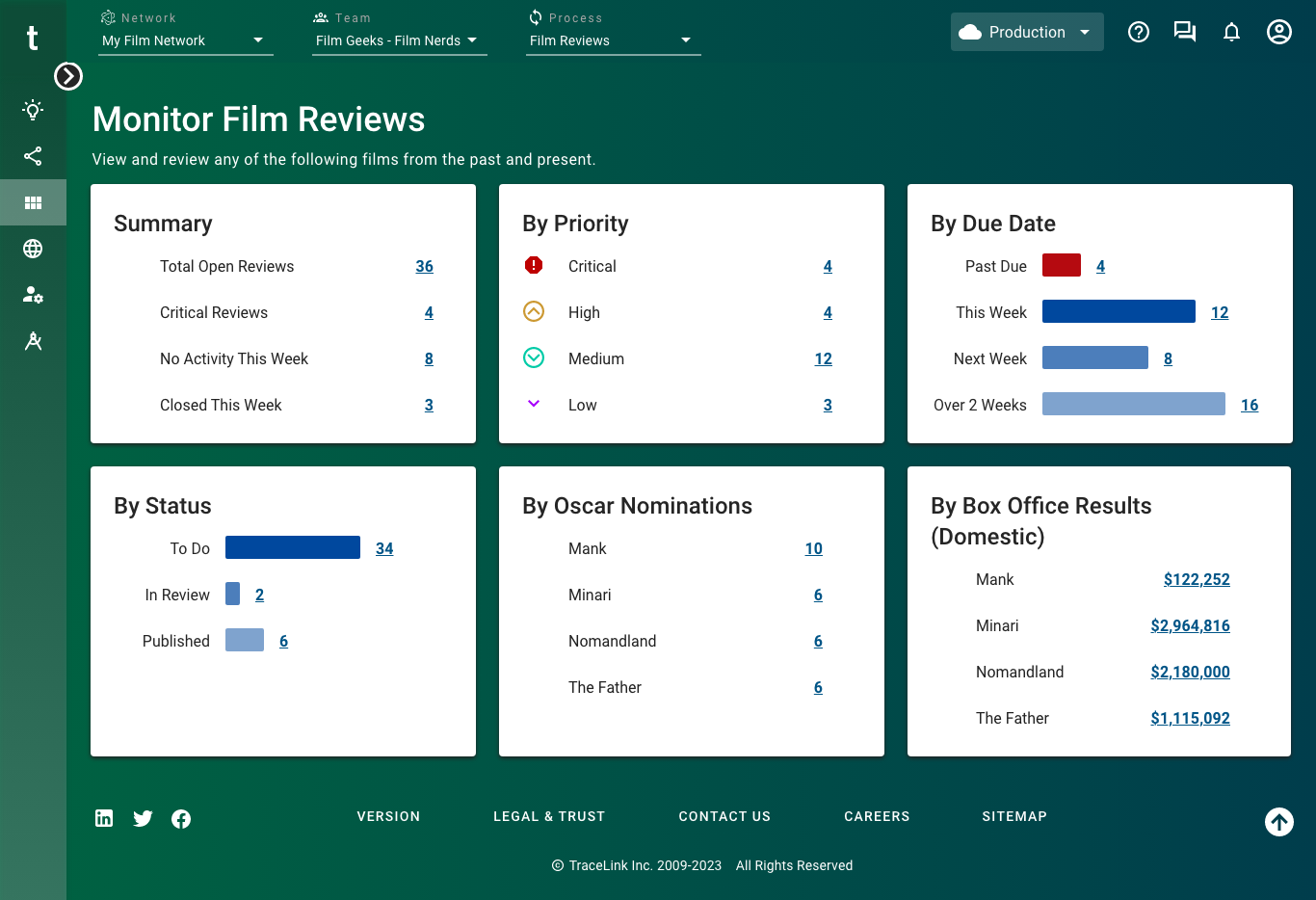
- — Displays if the user has permission to access one or more experience tasks. Provides all tasks within the specific network context (i.e. the network, team, and, if applicable, process selected in the network composer). The Do side menu should include the default Monitor, Search, and Add tasks.
- — Displays if the user is assigned a System Administrator or Application Administrator role. Allows administrators to configure apps, networks, Links, and users for their company. See the Administer Help Center for more information.
- — Displays if the user is assigned a Solution Administrator or Solution Developer role. Allows users to customize existing solutions and build new solutions for the apps that your company licenses. In Customize, users can extend the functionality surrounding the apps that their company owns by modifying app functionality and behavior to meet specific business needs, such as the following:
- Experiences for users with a specific job function (e.g. warehouse operators) or for the company’s business segment.
- Workflows that move business objects between states and can include additional logic.
- The data model where specific fields can be made required or optional.
- Roles and permissions that govern access to screens, functions, and data in the Web UI and through integration.
See the Customize Help Center for more information.
Experience tasks
Experience tasks display below the Do side menu item and allow users to navigate to the different tasks they need to accomplish. Tasks provide access to screens, which display in the content area. A single task can have many screens.
When they are present, the Monitor, Search, and Add tasks appear below the Do side menu item. Add additional experience tasks for other high-level actions you need to take action on.
The available tasks depend on the selected network and the user's role and permissions. For example, Monitor Incidents is a task within the Incident - Direct Supplier process for Agile Process Teams, and it only displays if the user has the relevant UI permission to view the task. You can customize how and whether your task displays in the side menu in Customize. See the Customize Help Center for more information.
Tasks—with their associated screens and components—can be shared across solutions at the environment-level, even if the solutions are for different apps. For example, Task X can be used by both Solution A and Solution B, even if Solution A and Solution B are for different apps. Logo
The TraceLink logo returns users to the landing page for the TraceLink Network.
The logo:
- Is always available, even when the side menu is collapsed.
- Always displays in the top left of the screen.
- Will always return users to the TraceLink Network landing page, regardless of where they currently are in the UI.
Content area
The content area of the framework contains the screens that make up a selected experience. Screens can fill all or part the content area, can be layered on top of each another (e.g. a dialog or overlay panel), and contain the components (e.g. tables, cards, buttons) that users interact with to complete various actions.
For more information on building screens, see Screen layouts. The content area:
- Always displays in the center of the screen framework, but what displays within the content area depends on what is selected (e.g. a task screen for a selected experience task, TraceLink University for a selected Learn menu item, Terms of Use screen for the selected footer link).
- Uses the grid to control the responsive spacing of the screen layout.
Footer
The footer directs users to TraceLink's social media presence, legal statements, versioning information, and high-level resources through static icons and text links.

The footer contains the following items:
- Social media icons – When selected, directs users to TraceLink's social media presence.
- – Displays only after users log in. When selected, the content area displays the current release version for the Opus Platform and copyright information.
- – When selected, the content area displays the TraceLink Trust Portal, which contains information regarding privacy and security, products and services, and compliance.
- – When selected, the content area displays the Contact Us screen, which provides information for TraceLink offices, key contacts, and additional resources you can use to reach us with any questions.
- – When selected, the content area displays the Culture and Careers screen, which provides general employment information, current job openings, and an online application portal.
- – When selected, the content area displays the sitemap list for TraceLink.com pages.
- icon – When selected, returns the user to the top of the screen.
The footer:
- Is always available across the bottom of all screens.
- Can't be collapsed but does have responsive width.
- Acts as a visual anchor for the screen that indicates to the user that the content area has ended.
- Can't be customized.


