Navigation
Navigation is how users move to and through an app to find and accomplish tasks. It should be simple and easy to learn. Good navigation should be:
- Predictable – Users can guess what things do successfully (e.g. clear labels, clickable buttons).
- Discoverable – Users can find where they want to go easily (e.g. links, tabs).
- Visible – Users know where they are (e.g. persistent top menu, breadcrumbs).
Our network navigation paradigm ensures an intuitive and consistent navigation pattern across all Opus applications:
Best practices
- Be predictable. Stick to familiar patterns and layouts.
- Be consistent. Don't make users think when they move from screen to screen.
- Be efficient. Define the optimal paths that users are most likely to take to minimize effort. User flows and task analyses are recommended UX exercises to determine the optimal path.
- Use object-oriented navigation. The navigation should be centered around actual objects (e.g. nouns and "things") that users interact with in the real world.
Hierarchy
The hierarchy refers to the structure of your information architecture (IA), which determines the order in which your content is accessed. A consistent, clear hierarchy across your experience improves navigation by helping users understand where they are and how elements relate to each other.
There are several navigation types depending on the direction of the movement within the hierarchy:
- Lateral navigation – Move between screens at the same level.
- Forward navigation – Move forward between screens at consecutive levels:
- Down the hierarchy one or more levels (e.g. a table link that displays a panel).
- Sequentially through a flow (e.g. steps to add a new object).
- Reverse navigation – Move backward between screens at consecutive levels:
- Up the hierarchy one or more levels (e.g. returning to a home page).
- Chronologically through screen history (e.g. breadcrumbs).
 For more information on building flows in Customize, see Screen flows.
Best practices
- Use visual elements, screen layouts, and components to indicate how content is related. For example:
- Show users where they are in the hierarchy and give them a way to navigate back up. For example:
- Progress Indicators show where a user is within a multi-step process.
- Screen Breadcrumbs provide the screen path and ensure users can easily return to a previous screen.
Navigation structure
There are two levels of navigation structure on the Opus Platform:
- Global navigation
- Local navigation
1. Global navigation
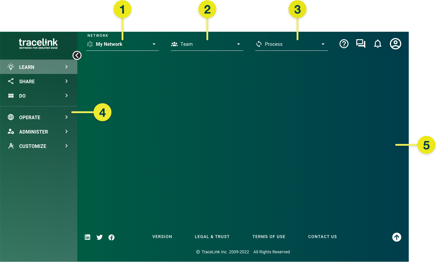
The global navigation is provided in the framework used across all screens on the Opus Platform. It includes the following persistent navigation elements:
- Header
- Side menu
- Footer
These are the things that users might need at any time, such as navigating between tasks, returning to the home page, or configuring user-specific utilities). These elements display on all screens, regardless of the task.
2. Local navigation
The local navigation applies to and is built within the content area of the screen. These are the navigation paths beween screens that you create so users can accomplish a task. They're unique to the experience task.
For guidance on common navigation paths between screens, see Screen flows.There are many ways to build connections and help users navigate the task. For example:
Best practices
- Include Screen Headers on every screen and Screen Breadcrumbs on non-primary screens so users always know where they are.
- Create a landing experience so users immediately understand what to do and where to go when they navigate to your experience.
- Use links to connect similar topics and content (e.g. links that launch quick view panels or anchor links within a single screen).
- Use meaningful link text. It should clearly indicate the destination so users know exactly where they're navigating to. See Writing for more information.
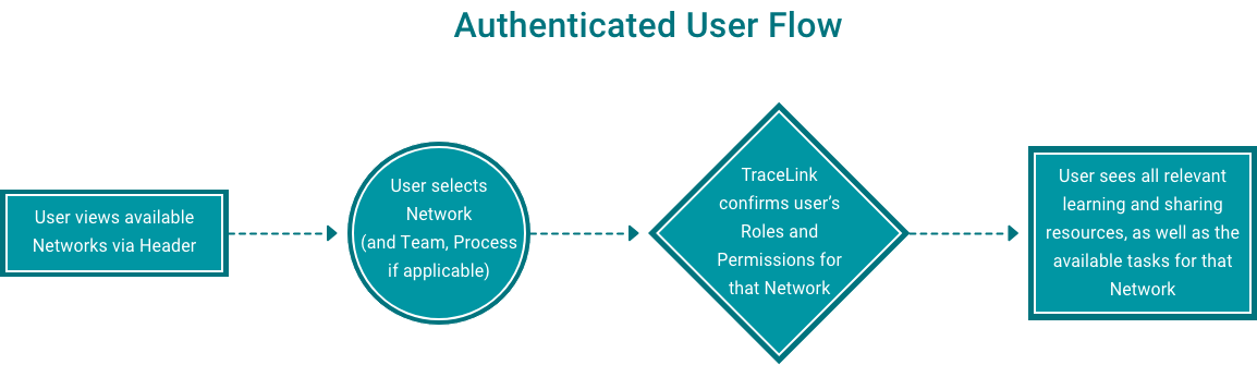
Network navigation
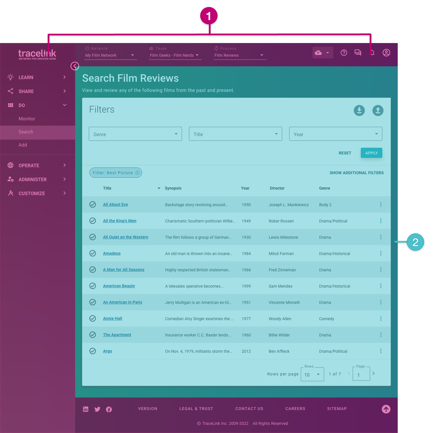
Networks are what let you navigate to an app and its solution on the Opus Platform. TraceLink's network-driven navigation paradigm provides a defined, consistent user flow to navigate across the platform seamlessly, using the global header as the primary navigation path that establishes the network context (i.e. the network name, team, and process selected from the network composer).
The network context also determines the available secondary navigation paths in the side menu. Users added to a network can access the resources and tasks available for the selected network context based on their roles and permissions.
You'll need to familiarize yourself with this paradigm before designing in anthem. Let's walk through the main concepts and the order in which they're defined in the hierarchy:
- Network
- Team
- Process
- Experience task
- Content area
Network context
The network context defines the where, who, and why:
- The network is the where—the digital collaboration space between an Owner and linked Partners.
- The team is the who—the people from the Owner and linked Partner who are collaborating together on a shared task.
- The process is the what—the physical objects that teams need to take action on.

Network
From the header, users first select the desired network from the drop-down in the network composer.
Networks represent your business ecosystem. A network is owned by a company and enables the execution of one or more processes. Networks can have linked entities, which can include Partner companies, Partner locations, and Owner locations based on the nature of the business processes the app supports and the requirements of the specific business context.
Each app has at least one network. Some multienterprise apps (e.g. APT) can have multiple networks based on the specific context of the business ecosystem's goals. For more information on configuring networks for an app, see the Administer Help Center.
The drop-down:
- Must be the first navigation element selected.
- Defines the network context for all subsequent selections.
Team
From the header, users select the Link from the drop-down in the network composer.
Each Link is a team made up of the people from the Owner and linked Partner (or with internal locations) who are collaborating together on a shared task. Available Links depend on the network selected.
The drop-down determines the processes available.
Process
From the header, users select the business function from the drop-down in the network composer. The process represents the physical objects that teams need to take action on.
Available processes depend on the network and team selected, the user's roles and permissions, and the app (some apps don't use processes).
The drop-down determines the experience tasks available in the side menu, which displays on the left side of the screen.
Experience task
From the side menu, users select the experience task.
Available tasks depend on the network context (i.e. the selected network, team, and process) and whether the user meets the defined visibility condition for the experience task (i.e. they have the necessary roles and permissions). The task's display label is defined for the experience in Customize.
When they are present, the Monitor, Search, and Add tasks appear below the Do side menu item. Add additional experience tasks for other high-level actions you need to take action on.
The selected task determines the screens that display in the content area.
Tasks—with their associated screens and components—can be shared across solutions at the environment-level, even if the solutions are for different apps. For example, Task X can be used by both Solution A and Solution B, even if Solution A and Solution B are for different apps.Content area
The content area is where the local navigation applies. From the content area, users can use local navigation elements from the task's landing experience to begin moving through the task and perform actions.
Primary, secondary, and in-page navigation actions are typically aligned on the right side of the screen (e.g. buttons, icons). Link navigation actions depend on the components used.
The content area:
- Is where all of the designed content for your experience displays for users to interact with.
- Uses the local navigation structure that you define for your task. The task's landing experience acts as the top of this structure.
The global navigation is always available and can be used at any time, regardless of your location within the task (e.g. you can always use the network navigator to navigate to another task or you can always select the TraceLink logo to return home).Best practices
- Use consistent in-page navigation and organization. For example:
- Use the recommended icons for in-page actions (e.g. add, export, edit).
- Leverage links for forward navigation between screens.
- Organize related content using Horizontal Tabs, Vertical Tabs, and Facets to allow users to navigate the content without leaving the screen.


