Button
Buttons allow users to take an action on a screen, panel, or dialog. There are three versions of buttons (primary, secondary, and tertiary) that correspond to an action's relative importance on a given screen.
- Usage
- Configuration
- Examples
Buttons represent a user action on a screen, panel, or other space. The three types of buttons correspond to an action's importance on the screen and allow users to quickly distinguish between the relative purpose of each button:
- Primary buttons are used for the central or primary task the user wants to accomplish (e.g. submitting a form, moving to the next step in a process).
- Secondary buttons support the primary action of the screen or section (e.g. saving a form) but are not necessary to complete that action.
- Tertiary buttons are most often used for cancel or exit actions (e.g. exiting a form without saving) but are also used for expansions and other actions that aren't integral to the user's primary task.
 Some components use buttons that cannot be configured (e.g. filter panels, forms). These buttons are automatically generated by the component and follow the same patterns for using primary, secondary, and tertiary button types, which expedites the process of building or customizing a screen.
 Anatomy
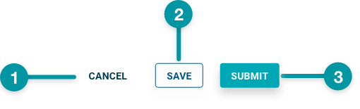
-
Tertiary button
-
Secondary button
-
Primary button
Best practices
- Configure Buttons on the same row of the grid, aligned to the bottom right.
- Provide users with a cancel action whenever possible, using a tertiary button.
- If only using 2 buttons, you may not need to use primary and secondary buttons necessarily. In many cases, only a primary and tertiary button are needed (e.g. a primary "save" button and a tertiary "cancel" button).
- When using all three buttons, place the primary button on the right of the container component, the secondary to the left of that, and the tertiary to the far left (i.e. moving from right to left in importance relative to the user's primary task). This helps improve the scannability of the component and translates effectively to mobile sizes.
- Avoid mixing icons and buttons in the same area.

Do
Configure buttons on the same row, aligned to the bottom right.
Don't
Stack buttons on separate rows on the grid or align to the left or center.
Common patterns
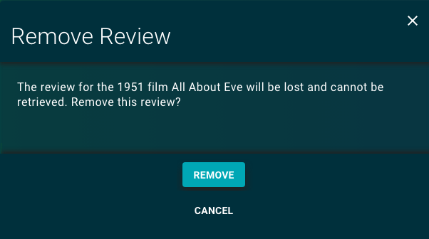
On dialogs and panels
Add buttons on the bottom right of dialogs and overlay panels for user actions. To account for reduced space, do not exceed 3 buttons (2 is preferred).

Properties
- field – Required. The label that displays on the button.
- drop-down – Required. Specifies which style preset to apply to the button:
- Primary – The primary button style, which is used for important, primary actions that users need to take (e.g. submit). Every form should have one Primary style button and there should not be more than one button with this style on a given screen.
- Secondary – The secondary button style, which is used for important actions that may not be required to complete the primary task on the screen (e.g. add another).
- Tertiary – The tertiary button style, which is used for less important actions that are never required to complete the primary task on the screen (e.g. cancel).
- checkbox – Optional. If selected, the button is enabled when the screen loads. If not selected, the button is disabled and can then be enabled by events in other components. Defaults to selected.
- field – Optional. The user's permission to access the component. If a user is not assigned a role that includes this permission, they cannot view or interact with the component.
- drop-down – Optional. If the user does not have permission to access the component, specifies whether to hide or disable it:
- Hide – The component is hidden.
- Disable – The component is visible but not cannot be interacted with.
Emitted events
- – The user selects the button.
Functions
- – When invoked in an event, the button is enabled.
- – When invoked in an event, the button is disabled.
- – When invoked in an event, returns the state of the button (i.e. whether it is enabled or disabled).
With primary and tertiary

- For Submit button:
- is set to "Submit".
- is set to Primary.
- is selected.
- For Cancel button:
- is set to "Cancel".
- is set to Tertiary.
- is selected.
With primary, secondary, and tertiary

- For Submit button:
- is set to "Submit".
- is set to Primary.
- is selected.
- For Save button:
- is set to "Save".
- is set to Secondary.
- is selected.
- For Cancel button:
- is set to "Cancel".
- is set to Tertiary.
- is selected.
In multi-step

- For Next button:
- is set to "Next".
- is set to Tertiary.
- is selected.
- For Save button:
- is set to "Save".
- is set to Secondary.
- is selected.
- For Cancel button:
- is set to "Cancel".
- is set to Tertiary.
- is selected.
- For Back button:
- is set to "Back".
- is set to Tertiary.
- is selected.


