Vertical Tabs
Vertical Tabs are tabs that align vertically on the left side of another component and provide internal navigation options as a means to organize information within a single screen. After navigating to a given screen using the network composer and the side menu, Vertical Tabs allow users to change the view of the information in the content area to the right of the tabs.
 Vertical Tabs should not be used to navigate between screens or hierarchies.
 - Usage
- Configuration
- Examples
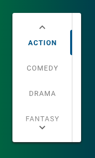
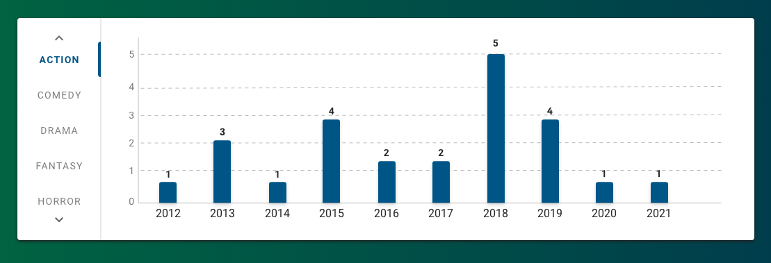
Vertical Tabs organize content within a single screen and allow users to move between different views of that content, which is displayed in the content area to the right of the tabs. Most commonly, Vertical Tabs are used with charts that display data horizontally (e.g. Bar Chart, Butterfly Chart) to view that data in various ways. For example, Vertical Tabs can allow users to view Oscar-nominated films by genre by selecting each genre tab. This approach contrasts with Horizontal Tabs, which are often used to sub-categorize information within the broader context of the screen.
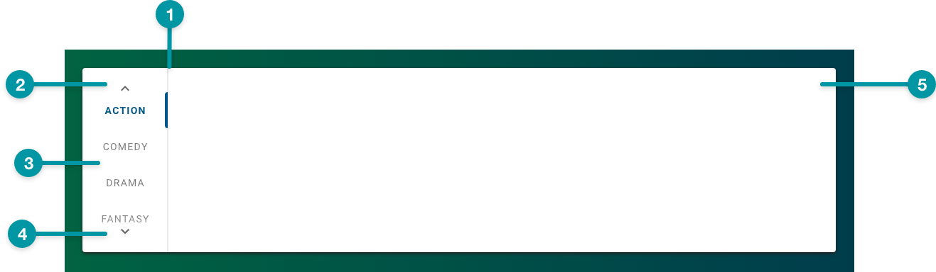
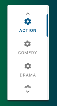
Anatomy
-
Card background
-
Tab (selected)
-
Tab
-
Next icon
-
Tab content area
Best practices
- Use Vertical Tabs to display alternate views of charts, especially charts that display data horizontally.
- Use Vertical Tabs to display high-level visual data; consider Horizontal Tabs or another component for text-heavy content.
- Organize tabs so that the content of each tab is at the same hierarchical level.
- Incorporating icons with tab labels can help make the tabs visually distinct at a glance, but they risk adding clutter. Add icons to your tabs only when they help to meaningfully differentiate the tabs from one-another.
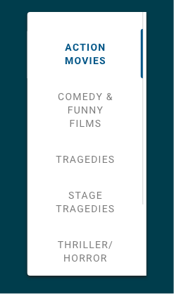
- Because they display in a more compact fashion, Vertical Tabs scale effectively to large numbers of tabs (7 or greater) compared to Horizontal Tabs. However, you should keep Tab labels concise and follow the writing guidelines, because long labels take away space from the content display area.
- Vertical Tabs are most useful for content displaying across all 12 columns of the grid (i.e. extra large on the grid). Avoid using Vertical Tabs for content spanning fewer than 6 columns in the grid as this can create accessibility issues. See Grid for more information.
Do
Label tabs with distinct categories whose content
is at approximately the same hierarchical level.
Don't
Don't label the tabs with categories whose content
is overly similar or may have a lot of overlap.
Common patterns
With Charts
Use Vertical Tabs to provide alternate views of the same data set using charts.
Properties
- section – Required. A section of properties used to configure vertical tabs, including the text and icon that displays:
- field – Required. The hover text that displays on the action icon or the menu item label.
- field – Optional. The tooltip text that displays when the user hovers over the tab.
- field – The UI icon that displays on the tab.
- field – Required. A unique identifier for the tab item.
- checkbox – Optional. If selected, the icon displays on the tab.
- field – Optional. Specifies the tab to set as active initially, starting from
1. - field – Optional. The user's permission to access the component. If a user is not assigned a role that includes this permission, they cannot view or interact with the component.
- drop-down – Optional. If the user does not have permission to access the component, specifies whether to hide or disable it:
- Hide – The component is hidden.
- Disable – The component is visible but not cannot be interacted with.
Emitted Events
- – The user selects a tab.
Functions
- – When invoked in an event, the selected tab displays when the screen loads.
- – When invoked in an event, the selected tab displays.
- – When invoked in an event, the data for the selected tab is retrieved based on the index.
- – When invoked in an event, the data for the selected tab is retrieved based on the tab ID.
With labels
- :
- not included.
- not selected.
- included with the first tab selected (set to
1).
With labels and icons
- :
- included.
- selected.
- included with the first tab selected (set to
1).


