Butterfly Chart
Butterfly Charts provide a comparison between two series of data from the same source using bi-directional horizontal bars, though the series on either side of the chart do not typically oppose each other. The data represented can also be categorized by color to represent relationships between similar data values.
- Usage
- Configuration
- Examples
The Butterfly Chart compares two related series of data. For example, one side of the chart could display ticket purchases by female movie-goers while the other side could display purchases by male movie-goers. The Butterfly Chart is helpful for displaying data in 2 dimensions simultaneously, where the relationship between the whole and the parts is clear.
While the Butterfly Chart can be useful, its design makes it more inclined than other charts to be misused or misunderstood. For example, viewers may be tempted to infer a contrasting or opposed relationship between the 2 sides of the chart, but this isn't necessarily the case.
 The Butterfly Chart should be a last option when other charts do not effectively convey the sometimes complex relationships between the whole data set and its parts.
Anatomy
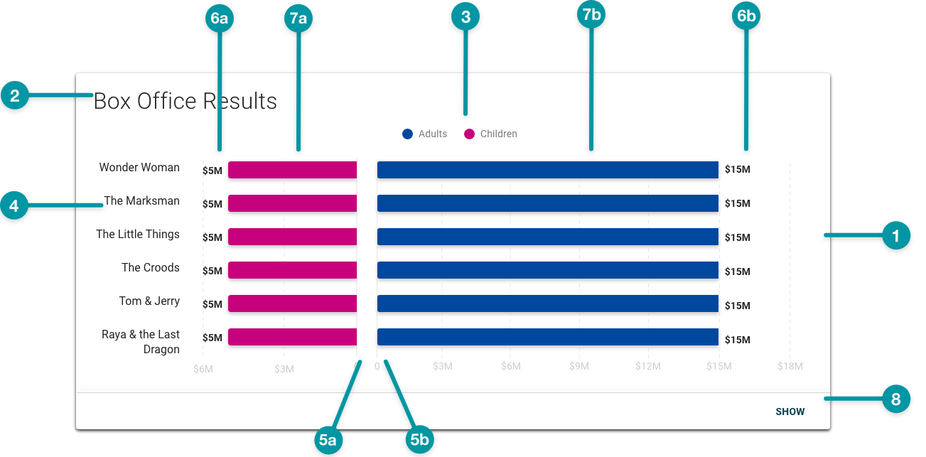
-
Card background
-
Chart title
-
Legend
-
Y-axis values
-
-
Plot area A X-axis
-
Plot area B X-axis
-
-
-
Plot area A data value
-
Plot area B data value
-
-
-
Plot area A bar
-
Plot area B bar
-
-
Expansion button
Best practices
- Use TraceLink accessible colors. Be especially careful to avoid using any tone of red and green together, because people with certain types of color blindness cannot distinguish between them.
- Configure Butterfly Charts as extra large components, and no smaller than medium, on the grid, and keep in mind that the smaller a chart is configured, the denser the data will display.
Common patterns
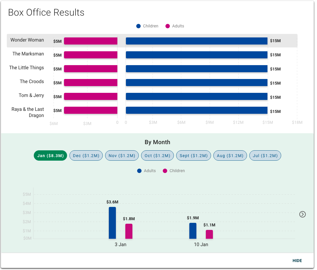
With Timeline Chart
The Timeline Chart can complement the Butterfly Chart by expressing the same data over time. For example, these charts could be configured so that a user could select a movie title in the Butterfly Chart and then open the details of that item to show ticket sales for that film month-by-month or a given time period in the Timeline Chart.
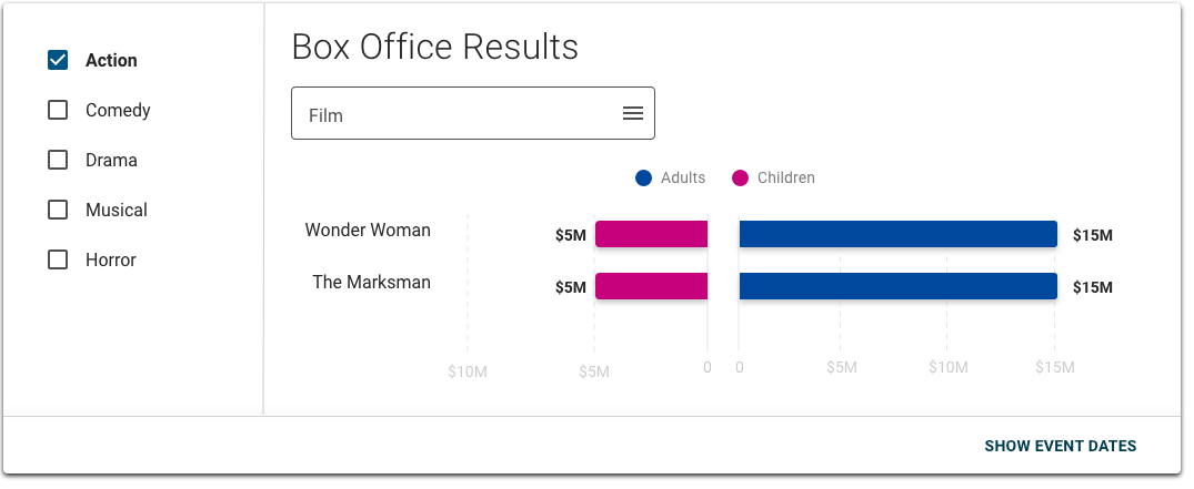
With List View
List View can complement the Butterfly Chart by allowing users to toggle the data displayed in the chart. For example, List View could provide genres users can select to display box office results for films in that genre in the Butterfly Chart. Configuring the built-in filter in the Butterfly Chart adds another layer of filter, too.

Properties
- checkbox – Optional. If selected, a card background is applied to the chart, which sets the component apart from the screen background. If not selected, the default background displays.
- field – Optional. The hex code for the butterfly chart background color.
- field – Required. The query that retrieves the data for plot area A on bar chart (i.e. the bars on the left side of the chart), including the and values, based on the data model.
-
field – Optional. A single expression using logical operators that determines when X values matching a specified condition are excluded from plot area A (e.g.
x>10). -
field – Optional. A single expression using logical operators that determines when X values matching a specified condition are excluded from plot area A (e.g.
y>10). -
field – Required. The label that displays for plot area A.
- field – Optional. The label that displays for the X-axis.
-
field – Optional. The label that displays for the Y-axis.
-
field – Optional. The hex code for the values displayed in plot area A.
-
section – Required. A section of properties used to configure the data that displays in plot area B (i.e. the bars on the right side of the chart):
- field – Required. The label that displays for the data series.
- field – Required. The hex code for the bars in plot area B.
-
field – Required. The query that retrieves the data for the butterfly chart, based on the data model.
-
field – Optional. A single expression using logical operators that determines when X values matching a specified condition are excluded from the chart (e.g.
x>10). -
field – Optional. A single expression using logical operators that determines when Y values matching that condition are excluded from the chart (e.g.
y>10). -
field – Optional. The title that displays for the chart.
- drop-down – Optional. Specifies the orientation of the chart:
- Vertical – The chart is oriented vertically.
- Horizontal – The chart is oriented horizontally.
 The Vertical chart orientation has been deprecated. Use the Horizontal orientation instead.
 -
drop-down – Optional. Specifies where the X axis labels display. This is valid only when is set to Vertical. Currently, the only available option for this field is Left.
 If is set to Horizontal, the X-axis labels display at the bottom of the chart.
 -
checkbox – Optional. If selected, a menu displays when a user selects a data point.
-
field – Conditionally required if is selected. The label that displays for the menu.
-
checkbox – Optional. If selected, grid lines display on the chart.
-
checkbox – Optional. If selected, data values display on each data point. If not selected, data values only display when the user hovers over them.
- checkbox – Optional. If selected, a filter for users to filter chart data displays.
-
field – Optional. Conditionally required if is selected. The query that retrieves the fields used to filter the chart data.
-
checkbox – Optional. If selected, users can toggle between displaying and hiding data in plot area A.
- checkbox – Optional. If selected, users can collapse and expand the chart.
- checkbox – Optional. If selected, the chart displays as collapsed when the screen loads.
- field – Optional. The label that displays as the button to expand and collapse the chart.
- checkbox – Optional. If selected, an Expand icon displays next to the button.
- checkbox – Optional. If selected, the chart displays with an expandable section that users can select to view any available additional information.
- checkbox – Optional. If selected, the chart is paginated if the content exceeds the available screen space.
-
field – Optional. The maximum number of values to display per page.
-
field – Optional. The user's permission to access the component. If a user is not assigned a role that includes this permission, they cannot view or interact with the component.
- drop-down – Optional. If the user does not have permission to access the component, specifies whether to hide or disable it:
- Hide – The component is hidden.
- Disable – The component is visible but not cannot be interacted with.
Emitted Events
- – The user selects a data point.
- – The user selects a menu item.
- – The user selects the additional info icon.
Functions
- – When invoked in an event, defines and applies additional conditions to the beyond the default.
- – When invoked in an event, the chart updates.
- – When invoked in an event, the X-axis value and Y-axis value are retrieved.
With filter
- not selected.
- not included.
- included.
- included.
- included.
- included.
- set to Horizontal.
- selected.
- selected.
- selected.


