List View
List View provides a list of objects in the system (e.g. filming locations) that users can quickly browse through and take action on.
- Usage
- Configuration
- Examples
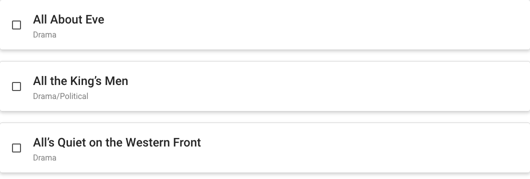
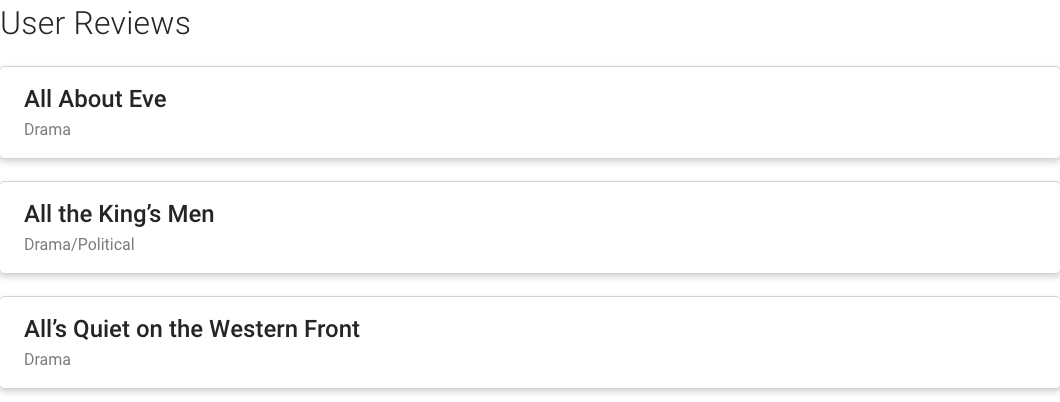
List View organizes content into a continuous group that allows users to take action on one or more items in that group. List View is most commonly used for managing objects in the system where one or more attributes of those objects are relevant (e.g. users or groups of users).
While List View has a lot in common with the Table View component in that both display data, List View is best used for situations when the data being displayed is relatively simple and the volume of that data is low. Table View is better for complex, varied data sets where the volume is high.
Anatomy
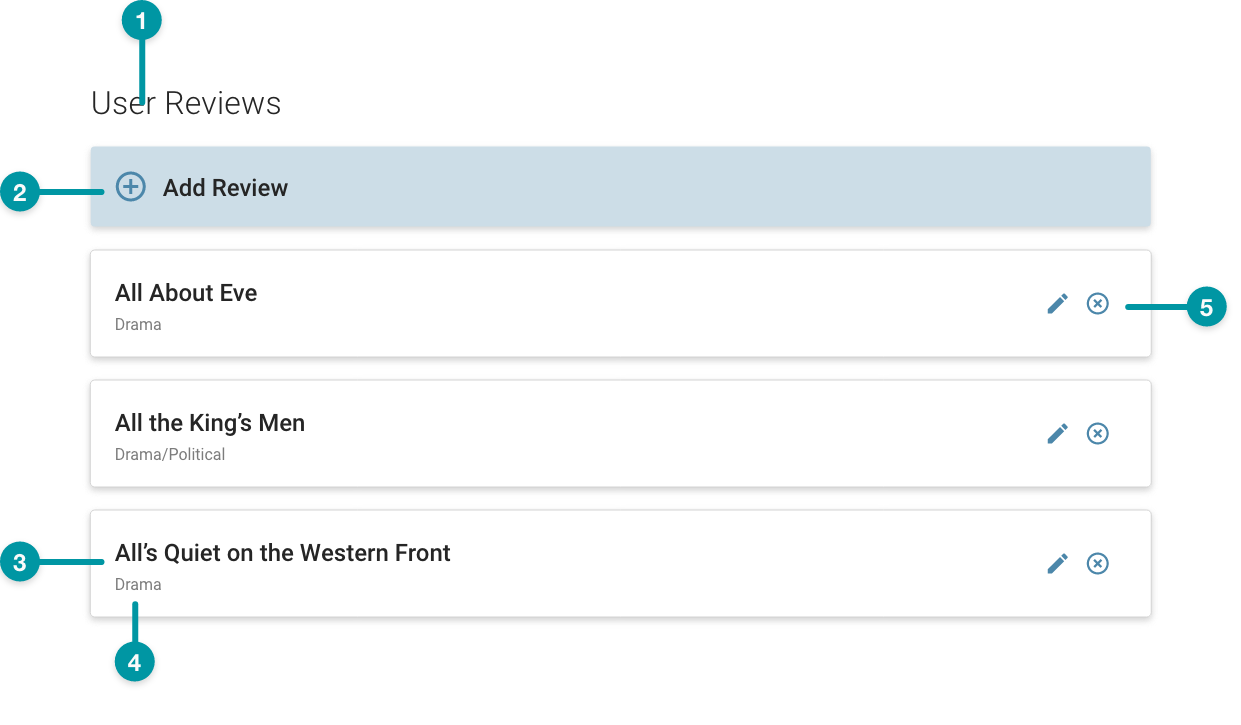
-
Title
-
Add list item button
-
List item
-
List item description
-
Actions
Best practices
- Position the icon for the primary action users take for objects in the list on the right-most portion of the list item, followed by secondary and tertiary actions to the left of the primary action icon.
- Sort lists in ways that make sense for the content (i.e. alphabetical, chronological).
- Configure List View no smaller than small on the grid to ensure the content is legible.
- Be consistent when using different display treatments (i.e. avoid mixing two different treatments for items at the same hierarchical level in the same list).
Common patterns
With Section Header
When displaying multiple Information Lists, a Section Header can help organize and provide structure to the screen.
Properties
- field – Optional. The title that displays for the list.
- checkbox – Optional. If selected, the title of the list displays.
- checkbox – Optional. If selected, the icon displays for each list item.
- checkbox – Optional. If selected, the action icons display for each list item.
- checkbox – Optional. If selected, the description that displays for each list item.
- drop-down – Optional. Specifies how to display the icons that display for the list items if the checkbox is selected:
- Plain – The icon displays with no background.
- Circle Background – The icon displays against a circle background.
- Square Background – The icon displays against a square background.
- field – Required. The query that retrieves the data for the List View, based on the data model. The following information is returned from the specified source: name, description (optional), icon (optional), and ID (internal use only).
- section – Conditionally required if the checkbox is selected. A section of properties used to configure the actions available for each list item:
- field – Conditionally required if the checkbox is selected. The UI icon that displays on the screen.
- field – Conditionally required if the checkbox is selected. The API called when the user selects the action.
- checkbox – Optional. If selected, the total quantity of list items displays.
- field – Required. The maximum number of list items. Defaults to 100.
- checkbox – Optional. If selected, a button displays at the top of the list, which allows users to add a list item.
- checkbox – Optional. If selected, a checkbox displays on each list item, which allows users to select the item.
- drop-down – Conditionally required if the checkbox is selected. Specifies whether to allow multiple list items to be selected at the same time:
- Multi-Selection – (default) Multiple list items can be selected at the same time.
- Single Selection – Only one list item can be selected at a time.
- checkbox – Optional. If selected, users can search the items in the list with a field that displays at the top.
- field – Optional. The label that displays on the button that allows users to add a list item.
- field – Required. The message that displays if there is no data available.
- field – Optional. The user's permission to access the component. If a user is not assigned a role that includes this permission, they cannot view or interact with the component.
- drop-down – Optional. If the user does not have permission to access the component, specifies whether to hide or disable it:
- Hide – The component is hidden.
- Disable – The component is visible but not cannot be interacted with.
Emitted events
- – The user chooses to add a list item.
- – The user selects a list item.
Functions
- – When invoked in an event, returns the selected list item and its relevant data.
- – When invoked in an event, selects the specified list item.
- – When invoked in an event, the list items are refreshed with updates.
With title, actions, and add item button
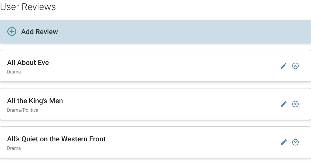
- included.
- selected.
- selected.
- selected.
- selected.
- is set to Plain.
- :
- included.
- included.
- selected.
- not selected.
- not selected.
- included.
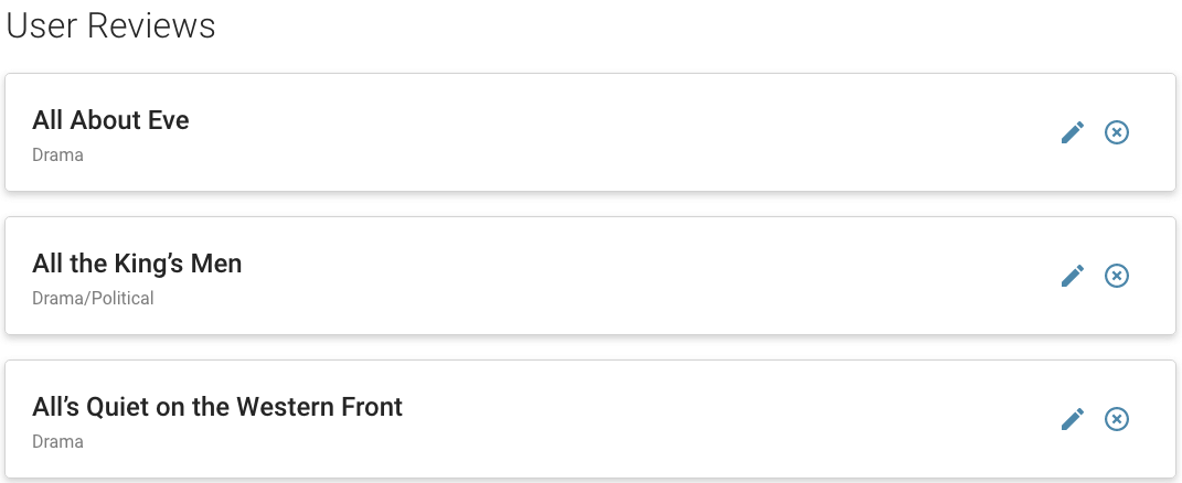
With actions only
- not included.
- selected.
- selected.
- selected.
- is set to Plain.
- :
- included.
- included.
- not selected.
- not selected.
- not selected.
- not included.
With multi-selection only
- not included.
- selected.
- not selected.
- selected.
- not selected.
- not selected.
- not selected.
- selected.
- set to Multi-Selection.
- not included.
With title only
- included.
- selected.
- not selected.
- not selected.
- selected.
- not selected.
- not selected.
- not selected.
- not included.


