Section Header
Section Headers identify a section of the screen, adding structure to screens with varied content.
- Usage
- Configuration
- Examples
The Section Header helps to visually separate sections on the same screen so that users can quickly see all the different types of information. Section Headers are particularly useful for organizing content on dashboards or on screens with data-heavy forms or reports, where data may be coming from varied sources and display in various ways.
Anatomy
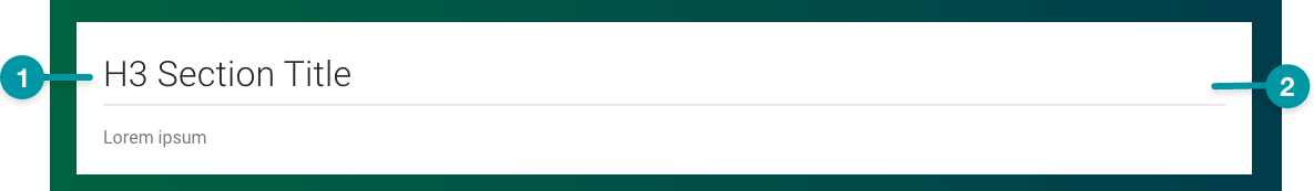
-
Title
-
Card background
Best practices
- Configure the Section Header to take up the full width of the screen (i.e. size extra large on the grid).
- When there are 2 or more sections on a screen, add a chevron icon to make sections collapsible with a Toolbar.
- Set collapsible sections to be open by default except when working with multiple sections where it's necessary to direct the user's attention to a particular section.
- Write clear and descriptive Section Headers. Follow the writing guidelines.
- Title each Section Header in a way that's distinct from other Section Headers on the screen and does not re-use elements of the Screen Header title (e.g. if the Screen Header title is "Oscar-Nominated Films", avoid Section Header titles like "Oscar-Nominated Films: Drama").

Do
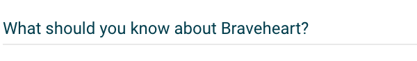
Write concise Section Headers that make use of the context of the screen.
Don't
Don't write overly long Section Headers.
Common patterns
With Help Tooltip
Adding a Help Tooltip can quickly provide users with additional information about the content of a section, or link out to other help content.

Properties
- checkbox – Optional. If selected, a card background is applied to the section header, which sets the component apart from the screen background. If not selected, the default screen background displays.
- field – Required. The static text for the section title.
- field – Optional. Specifies a display style in JavaScript to apply to the title text.
-
field – Optional. The user's permission to access the component. If a user is not assigned a role that includes this permission, they cannot view or interact with the component.
- drop-down – Optional. If the user does not have permission to access the component, specifies whether to hide or disable it:
- Hide – The component is hidden.
- Disable – The component is visible but not cannot be interacted with.
Functions
- – When invoked in an event, the title text is saved.
With card background

- included.


