Help Tooltip
Help Tooltips provide additional information about a specific UI element, opened by selecting the help icon beside the UI element. Help Tooltips are used in conjunction with other components and cannot be used on their own.
- Usage
- Configuration
- Examples
The Help Tooltip provides additional information about a UI element, most commonly on forms or other components where the UI element may be complex or difficult to explain using assistive text.
Help Tooltips should be used selectively. Before adding one, make sure field labels are clear and consider whether adding assistive text could do the work of a Help Tooltip.
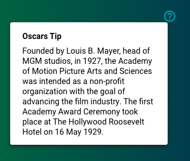
Anatomy

-
Title Help
-
Help icon
-
Additional help link
-
Card background
-
Text
Best practices
- Write clear, succinct Help Tooltips that follow the writing best practices.
- In general, use Help Tooltips only after determining that the field label and assistive text are insufficient in clarifying the purpose of a UI element.
- Help Tooltips should remain within a single column on the grid.
- If the additional information needed to clarify a UI element is on another screen, provide a link to that screen with some help context in the Help Tooltip.
- When providing help content in addition to a link, avoid rehashing the content in the linked page in the Help Tooltip.

Do
Write brief, descriptive text that relates directly to the UI element
it's describing.
Don't
Don't write tips that only indirectly relate to the UI element
in question.
Common patterns
With Action Form
Help Tooltips can be helpful on the Action Form, where large or complex portions of content are displayed.

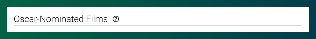
With Section Header
Help Tooltips are often added to Section Headers to help provide additional information about the section that cannot be communicated through assistive text (i.e. the additional information requires more detail or a link out to other related content).
Properties
- field – Optional. The title that displays in the Help Tooltip pop-up.
- field – Optional. The text content of the Help Tooltip pop-up.
- field – Optional. A link that displays in the Help Tooltip pop-up to direct the user to additional information or resources.
- field – Optional. The user's permission to access the component. If a user is not assigned a role that includes this permission, they cannot view or interact with the component.
- drop-down – Optional. If the user does not have permission to access the component, specifies whether to hide or disable it:
- Hide – The component is hidden.
- Disable – The component is visible but not cannot be interacted with.
Title only
- included.
- included.
- not included.
Title and additional help link

- included.
- included.
- included.
Content only

- not included.
- included.
- not included.


