Action Form
Action Forms allow users to add new objects, edit information about objects, or view information about objects (e.g. a list of users). This component is useful for creating forms with a large number of fields.
- Usage
- Configuration
- Examples
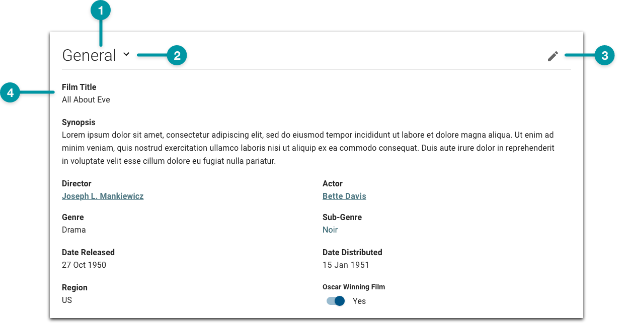
The Action Form is a flexible component that allows users to view or input all the attributes of a particular object (e.g. for a film, this could be the title, year, director, genre).
In general, there are 3 main ways a form is used: adding content, editing existing content, and displaying read-only content. Because of this inherent flexibility, forms can range in size from very short, with only a few fields, to very long, where there are many attributes to be added or edited for a particular object. Additionally, a user's access to a form and the fields available in that form can vary based on permissions.
Anatomy
-
Group label
-
Group expand icon
-
Group action icon
-
Text field (read-only)
Best practices
- Always provide a cancel Button on forms.
- For accessibility, leave text color as default on all inputs.
- Configure Action Forms as extra large components on the grid, as they contain their own internal grid that organizes content.
- Use groups to structure your form and use clear labels for those groups.
- If using more than one group, configure the form to allow users to collapse and expand the sections as needed.
- Provide field label names that don't repeat the group or form title. Follow the writing guidelines.
- If included, position comment or attachment sections at the bottom of the form. For long forms, or where attachments might be added before completing a form, include an attachment button in the Toolbar.
Do
Keep field labels short.
Don't
Don't add long or ambiguous field labels.
Common patterns
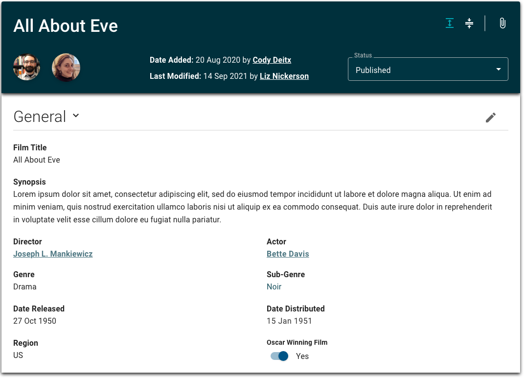
With Screen Header, Toolbar, Workflow Transition, and Formatted Content
Action Forms are often combined with a collage of other components that combine to create a header for the form. The Screen Header provides a title; the Toolbar allows users to add attachments, copy values, and perform other basic functions on a form; the Workflow Transition allows users to update the form's state; and the Formatted Content can display active users and the dates the form was updated.
On panels
Panels often use Action Forms to allow users to quickly edit the attributes of an object and then save or cancel changes. Overlay panels should be used for simple actions that have fewer than 7 steps. For actions with greater than 7 steps, use a dedicated screen. See action panels for more information.

Properties
- field – Optional. The title of the form.
- section – Optional. A section of properties used to configure a group of fields on the form:
- field – Optional. The label for the group that displays on the screen.
- field – Required. The unique identifier for the group; internal use only.
- field – Optional. The order the groups display in.
- field – Optional. Additional variables and values that are required beyond what the user submits to ensure proper functionality of the form (e.g. mapping, value indexing).
- field – Optional. The values that are displayed for each field by default when the screen loads.
- checkbox – Optional. If selected, the form does not automatically save while in Edit mode.
- section – Optional. An array of properties used to configure a subgroup, which includes the display treatment, included fields, and the type of input those fields accept:
- drop-down – Optional. Specifies whether the subgroup displays across one or both columns:
- Full – (default) The subgroup displays across both columns.
- Half – The subgroup displays across one column.
- checkbox – Optional. If selected, any optional columns that are empty are removed from the form and the remaining columns are rearranged.
- checkbox – Optional. If selected, the fields within the subgroup are grouped together and users can add a row with all fields in the subgroup at once.
- field – Optional. The order the subgroups display in.
- section – Optional. A section of properties used to configure fields included in the subgroup:
- field – Required. The label that displays on the screen.
- field – Optional. Additional text that displays below the field, which adds context to the field.
- checkbox – Optional. If selected, the field is required for users to submit the form successfully.
- drop-down – Optional. The type of input for adding and editing data:
- Default Input – The component automatically decides the input field to display, based on the data model (i.e. text field, drop-down, radio buttons).
- Period Range Input– The user inputs a date range.
- Type-ahead Input – The user can search for and select a value from an auto-populated list.
- Available Values Input – The user can select from the available values, which include the number of filtered results for each value.
- Attachment Input – The user attaches a file by selecting a file from their local system or dragging and dropping the file.
- drop-down – Optional. The display treatment for viewing data:
- Attachment Treatment – The user attaches a file by selecting a file from their local system or dragging and dropping the file.
- Available Values Input Treatment – The user can select from the available values, which include the number of filtered results for each value.
- Editable Table Treatment – If selected, the data displays in a table format.
- Tall String Treatment – The user inputs text into an enlarged field that allows more multiple lines of text.
- field – Optional. If the is set to Period Range Input, the default date for a custom date picker field is offset by this number of days in the future from present date.
- – Optional. If the is set to Available Values Input, the array of key-value pairs that define the list of field values:
- field – Optional. The field value.
- field – Optional. The label that displays for the value.
- field – Optional. If the is set to Attachment Input, the TraceLink app that authorizes the file import.
- field – Optional. If the is set to Attachment Input, the name of the Message Processing Framework message type used to receive a notification upon successful file import.
- field – Optional. If the is set to Attachment Input, the tag assigned to the file by the app (e.g. the report type).
- field – Optional. If the is set to Attachment Input, the version of the transform to use.
- checkbox – Optional. If selected and the is set to Type-ahead Input, the type-ahead field automatically selects a value when it is the single returned value of the field query.
- checkbox – Optional. If selected, the field is editable. Defaults to selected.
- drop-down – Optional. Specifies whether the subgroup displays across one or both columns:
- checkbox – Optional. If selected, groups cannot be collapsed.
- checkbox – Optional. If selected, groups are expanded when the screen loads.
- field – Optional. The message that displays if the form is saved successfully. If no value is provided, the default message displays.
- field – Optional. The message that displays if the form is not saved successfully. If no value is provided, the default message displays.
- field – Required. Specifies the type of action taken by the user:
- Add – The user adds a new object (e.g. a direct supplier incident, a new user). The following properties are used to configure the add action:
- field – Optional. The API for add actions, which contains the necessary fields.
- field – Optional. The attributes used to map the form data to the data model.
- View and Edit – The user views or edits an existing object. The following properties are used to configure the view and edit actions:
- field – Optional. The API for view and edit actions, which contains the necessary fields.
- field – Optional. The attributes used to map the form data to the data model.
- Include and Exclude - The user selects elements that can be included in the object or must be excluded from the object. The following properties are used to configure the include and exclude actions:
- field – Optional. Specifies if the user is able to include or exclude elements.
- drop-down - Optional. Specifies if selecting an element includes or excludes it from the object:
- Excluded – (default) The selected element is excluded from the object.
Included – The selected element is included in the object.
- checkbox - Optional. If selected, the elements are unselected by default.
- checkbox - Optional. Specifies if the element is selected.
- field - Optional. The label that displays for the group of elements.
- - Optional. The name of the element.
- Add – The user adds a new object (e.g. a direct supplier incident, a new user). The following properties are used to configure the add action:
- checkbox – Optional. If selected, the form is read-only and cannot be edited once saved.
- field – Optional. The label that displays on the button that cancels the form and discards the values.
- field – Optional. The label that displays on the button that submits the form and its values.
- checkbox – Optional. If selected, the default form buttons are hidden.
- checkbox – Optional. If selected, the form is set as hidden and will not display when the screen loads (e.g. the form is hidden until the user takes an action in another component that requires the form, at which point the form displays).
- field – Optional. The hex code for the form background color.
- field – Optional. The hex code for the text color on the form (e.g. the field labels and values).
- field – Optional. The user's permission to access the component. If a user is not assigned a role that includes this permission, they cannot view or interact with the component.
- drop-down – Optional. If the user does not have permission to access the component, specifies whether to hide or disable it:
- Hide – The component is hidden.
- Disable – The component is visible but not cannot be interacted with.
-
checkbox – Optional. If selected, form data is not cached.
Emitted events
- – The user saves changes to the form.
- – The user cancels changes to the form; the form reverts back to its previously saved version.
Functions
- – When invoked in an event, the form or field group collapses.
- – When invoked in an event, the form or field group expands.
- – When invoked in an event, the screen automatically scrolls to the first open group of fields.
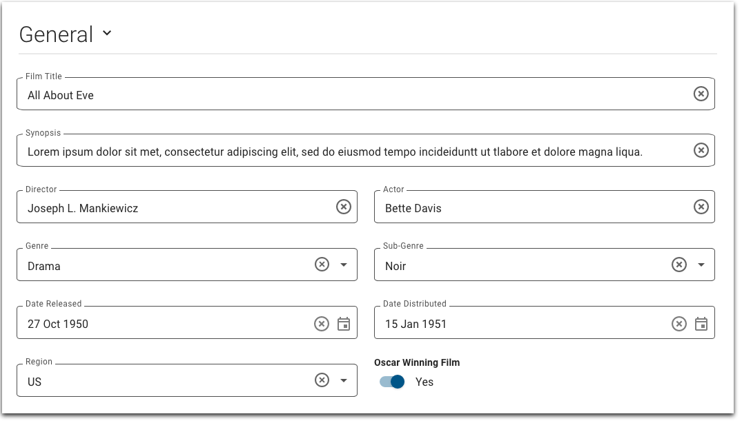
In edit mode
- :
- included and set to General.
- included.
- configured.
- included.
- included and set to General.
- not selected.
- not selected.
- not selected.
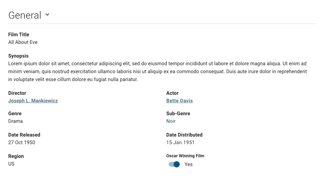
In read-only mode
- :
- included and set to General.
- included.
- configured.
- included.
- included and set to General.
- selected.
- not included.
- not included.
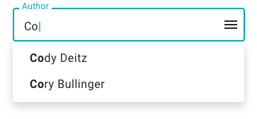
Input types
 In many cases, the input type for a particular field is set to Default Input Type. In this case, the component automatically decides the input field to display, based on the data model (i.e. text field, drop-down, radio buttons). This option speeds up the design process because the Solution Developer doesn't need to manually select the input type for each field unless it differs from the data model default.
 Type-ahead
The user can search for and select a value from an auto-populated list.
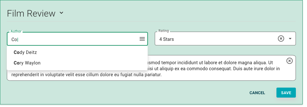
- :
- set to Type-ahead Input.
Available Values Input
- :
- set to Available Values Input.
Date Range Input
The user inputs a date range.
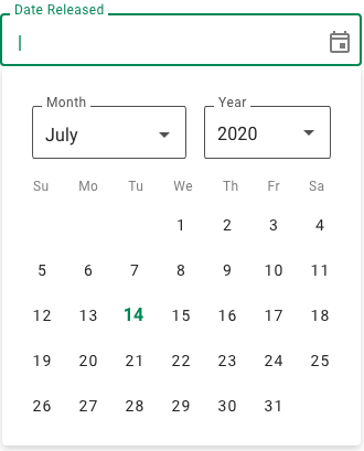
- :
set to Date Range Input.
Attachment
The user attaches a file by selecting a file from their local system or dragging and dropping the file.

- :
set to Attachment Treatment.


