Toolbar
Toolbars provide a row of actions aligned horizontally with the Screen Header, such as toggles that switch between dashboard and table views.
- Usage
- Configuration
- Examples
The Toolbar enables users to edit or otherwise take action on data in another component and is most commonly used in the same row as the Screen Header, though it can be used alongside other components as well. Users act on the content displayed by selecting actions. For example, the Toolbar could include a group of two actions that allow users to switch the way the data is displayed on the screen (i.e. from a dashboard view to a table view and vice-versa).
The functionality provided by the Toolbar is dependent on where it's included. A Toolbar added to a chart might enable users to download chart data, whereas a Toolbar added to the Screen Header might allow users to toggle between a dashboard and table view.
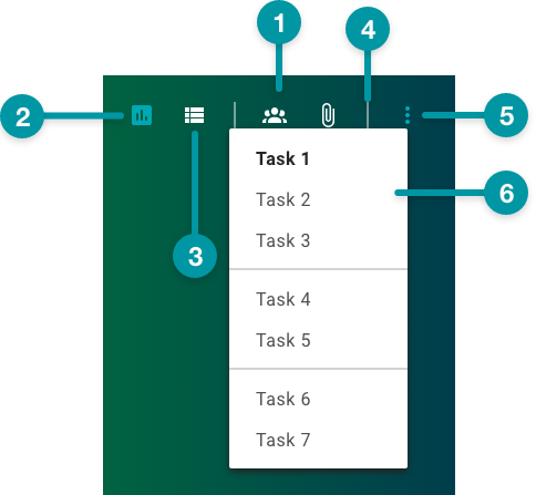
Anatomy
-
Background color
-
Active toggle
-
Inactive toggle
-
Group divider
-
Action group
-
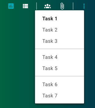
Task menu
Best practices
- Place view toggles all the way to the left in the Toolbar.
- If a Toolbar contains an Action group (i.e. a menu kebab icon, which users select to access additional tasks), position it all the way to the right in the Toolbar.
- Include no more than 3 groups in the Toolbar and no more than 3 tasks per group; limit the number of actions in a task menu to 9 (ideally in groups of 2).
- Configure the Toolbar in a single column of the grid.
- If additional tasks are needed, turn at least one group into the Action group.
- Where space is limited, an Action group can be included as the only task.

Do
Limit the Toolbar to 3 groups of 3 actions per group.

Don't
Don't overwhelm the user with too many actions, or actions
not organized into groups.
Common patterns
With Screen Header
The Toolbar is a common addition to the Screen Header where basic functionality, such as collapse and expand, is added.
With Screen Breadcrumb
Toolbars are often added to screen breadcrumbs made using Screen Breadcrumb to allow users to toggle the display of content on the screen.

Properties
- section – Optional. A section of properties used to configure a toolbar group, including the available actions and how the buttons and icons for those actions function:
- field – Required. The name of the task item.
- checkbox – Required. If selected, the action group is enabled. Defaults to selected.
- section – Required. A section of properties used to configure an action:
- field – Required. The label that displays for the action.
- field – Required. The UI icon that displays for the action.
- checkbox – Required. Specifies whether the action is enabled. Actions are enabled by default.
- checkbox – Optional. If selected, the action icon displays as selected when the screen loads. This property applies only to actions with a of Toggle.
- drop-down – Optional. Specifies whether the action acts as a toggle switch or a standard action button:
- Toggle – The action acts as a toggle switch.
- Trigger – The action acts as a standard action button.
- checkbox – Optional. If selected, the toolbar displays as an Action Menu (i.e. as a single Action icon that displays a menu with each action when selected).
- checkbox – Optional. If selected, action icons display when the toolbar is in Action Menu form.
- field – Optional. The hex code for the toolbar background color.
- field – Optional. The hex code for the action icon color in the toolbar.
- drop-down – Optional. Specifies the horizontal alignment of the toolbar:
- Left – The toolbar displays left-aligned.
- Center – The toolbar displays center-aligned.
- Right – The toolbar displays right-aligned.
-
field – Optional. The user's permission to access the component. If a user is not assigned a role that includes this permission, they cannot view or interact with the component.
- drop-down – Optional. If the user does not have permission to access the component, specifies whether to hide or disable it:
- Hide – The component is hidden.
- Disable – The component is visible but not cannot be interacted with.
Emitted events
- – The user selects an action.
Functions
- – When invoked in an event, returns the state of the action (i.e. whether the action is selected or not).
- – When invoked in an event, returns all actions.
- – When invoked in an event, activates a task, triggering the action's corresponding function.
- – When invoked in an event, activates an action that is configured as a Toggle.
-
– When invoked in an event, activates an icon.
With groups
- :
- selected.
- :
- set to Toggle.
- selected.
- selected.
- not included.
- not included.
- set to Right.
Without groups

- :
- not selected.
- :
- set to Toggle.
- not selected.
- not included.
- not included.
- set to Right.


