Timeline Chart
Timeline Charts display a series of data over a specific period of time using vertical bars. The data represented can also be categorized by color to represent relationships between similar data values.
- Usage
- Configuration
- Examples
The Timeline Chart compares quantities of a particular value across a period of time, most often for event-driven processes. Generally, the Timeline Chart is used in situations where the broader context of the data is already known, so the data is more specific (e.g. average ticket prices in a given country over a specified period of time).
This chart is often used in place of the Bar Chart. While the Bar Chart can compare quantities across a large time period, the Timeline Chart can show that same data over specific sections of that time period, because the Timeline Chart only shows 7 data points per page.
Anatomy
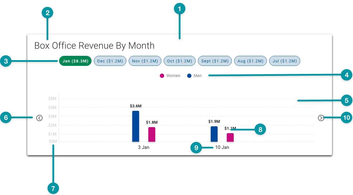
-
Card background
-
Chart title
-
Time period filter chip (selected)
-
Legend
-
Grid line
-
Y-axis value
-
X-axis value
-
Bar
-
Data value
-
Next icon
Best practices
- Use TraceLink accessible colors. Be especially careful to avoid using any tone of red and green together, because people with certain types of color blindness cannot distinguish between them.
- If a series is intended to show a monetary gain or similar positive increase, use Emerald. Conversely, if a series is intended to show monetary loss or negative decrease, use TraceLink Red.
- Configure Timeline Charts as extra large components, and no smaller than small on the grid, and keep in mind that the smaller a chart is configured, the denser the data will display.
- When incorporating a Timeline Chart into another chart's expansion, configure the Timeline Chart as the same size as the parent chart.
- Because the Timeline Chart displays a maximum of 7 filter chips per page, select the period filter that makes the most sense for the values (e.g. if changes in the values are more apparent month-to-month than week-to-week, select the weekly period filter).
- If pairing a Timeline Chart with another component on the same row, provide a title for each component.
Common patterns
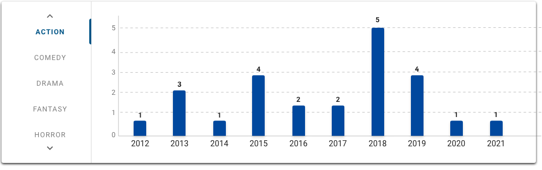
With Vertical Tabs
Vertical Tabs allow users to switch between different views of the same chart when paired with a Timeline Chart. See how the genre tabs display different data from the same data source in the images below. This pattern is particularly useful when there are enough objects that a legend would be impractical.
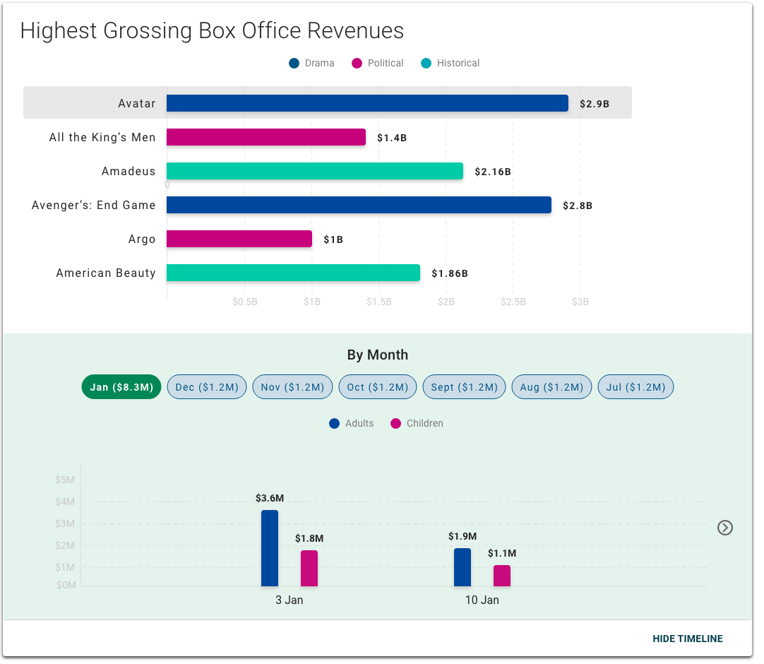
With Bar Chart
Timeline Charts are often incorporated into the Bar Chart expansion, which can show the selected variable or data point over time. For example, a user could select a movie title in the Bar Chart and see in the Timeline Chart a breakdown of ticket sales by gender over different time periods.
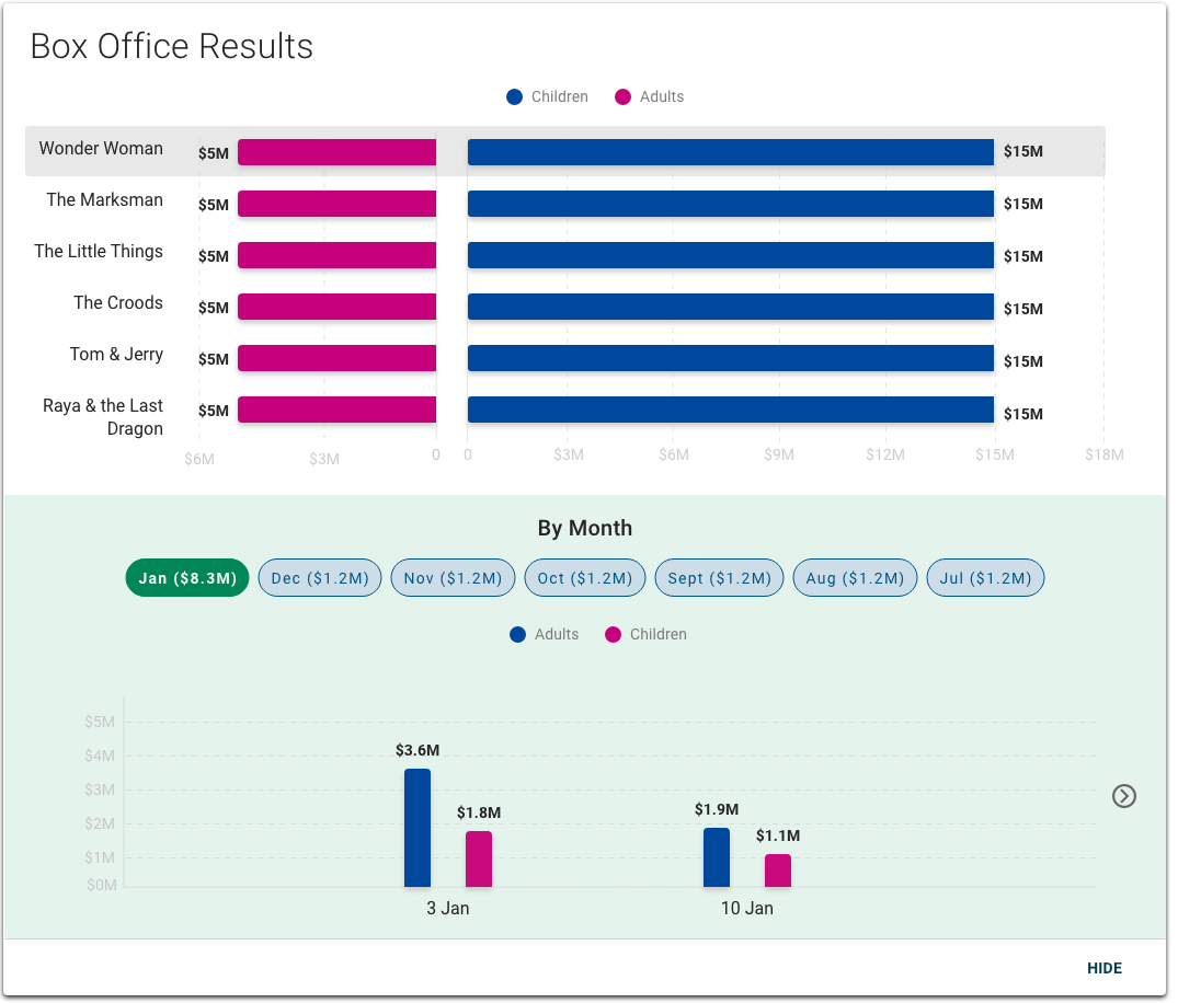
With Butterfly Chart
When added in the expansion, the Butterfly Chart can complement the Timeline Chart by expressing the hierarchical relationships of the same data set. For example, a user could select a movie title in the Timeline Chart that displays ticket sales for that film over time and see in the Butterfly Chart a breakdown of ticket sales by gender.
Properties
-
checkbox – Optional. If selected, a card background is applied to the chart, which sets the component apart from the screen background. If not selected, the default background is used.
- field – Optional. The hex code for the timeline chart background color.
- section – Required. A section of properties used to configure the data that displays on the chart:
- field – Required. The label that displays for the data series, retrieved from the .
- field – Required. The hex code for the data series.
- field – Required. The query that retrieves the data series, including the and values, based on the data model.
- field – Optional. The GraphQL query that maps the data series values to the chart.
- field – Optional. The conditions that set the initial parameters required to load the component and ensure proper functionality of the chart.
- field – Optional. A single expression using logical operators that determines when X values matching a specified condition are excluded from the chart (e.g.
x>10). - field – Optional. A single expression using logical operators that determines when Y values matching that condition are excluded from the chart (e.g.
y>10). - field – Optional. The label that displays for the X-axis.
- field – Optional. The label that displays for the Y-axis.
- field – Optional. The title that displays for the chart.
- checkbox – Optional. If selected, a menu displays when a user selects a data point.
- field – Conditionally required if is selected. The label that displays for the menu.
- checkbox – Optional. If selected, data values display on each data point. If not selected, data values only display when the user hovers over them.
- checkbox – Optional. If selected, grid lines display on the chart.
- checkbox – Optional. If selected, data values display on each data point. If not selected, data values only display when the user hovers over them.
- checkbox – Optional. If selected, users can select a facet to filter the chart data based on a specific time period.
- checkbox – Optional. If selected, the Collapse icon displays next to the button.
- checkbox – Optional. If selected, the chart displays as collapsed when the screen loads.
- field – Optional. The label that displays as the button to expand and collapse the chart.
- checkbox – Optional. If selected, the chart displays with an expandable section that users can select to view any available additional information.
- checkbox – Optional. If selected, a pop-up containing the relevant data value displays when a user selects a data point.
- drop-down – Optional. The display treatment for viewing data:
- Group – The data is represented as a group bar chart (i.e. bars are grouped together to display two related variables side-by-side), which is commonly used to compare values between categories of two or more groups.
- Stack – The data is represented as a stacked bar chart (i.e. bars are stacked in two or more divisions, each representing a different category or variable), which is commonly used to compare values between categories of two or more groups.
- drop-down – Optional. The axis labels that display on each data point when the user hovers over it:
- X-axis – The X-axis label displays as a tooltip when the user hovers a data point.
- Y-axis – The Y-axis label displays as a tooltip when the user hovers a data point.
- checkbox – Optional. If selected, the collapse icon is disabled.
- field – Optional. The label that displays for the menu item.
- field – Optional. The screen that displays when users select the menu item.
- field – Optional. The message that displays if there is no data available.
- checkbox – Optional. If selected, Y-axis values of zero do not display.
- section – Optional. A section of properties used to configure the time period filters for the chart:
- checkbox – Optional. If selected, the section displays.
- field – Optional. The time period interval to filter by (e.g. year, month, week, day).
- field – Optional. The query that retrieves the time period filter data, based on the data model.
- field – Optional. The user's permission to access the component. If a user is not assigned a role that includes this permission, they cannot view or interact with the component.
- drop-down – Optional. If the user does not have permission to access the component, specifies whether to hide or disable it:
- Hide – The component is hidden.
- Disable – The component is visible but not cannot be interacted with.
- drop-down – Optional. The alignment for the time period filter and legend values.
- Left – (default) The time period filter and legend values are left aligned.
- Center – The time period filter and legend values are center aligned.
- Right – The time period filter and legend values are right aligned.
- field – Optional. The height of the component as a percentage of the containing component's height. If specified, the height of the component is constant and does not change based on the contents of the data series. If not specified, the height of the component changes based on the plotting of the data series. The minimum value is 20 and the maximum value is 80.
Emitted Events
- – The user selects a data point.
- – The user selects a menu item.
- – The user selects the additional info icon.
Functions
- – When invoked in an event, defines and applies additional conditions to the beyond the default.
- – When invoked in an event, the X-axis value and Y-axis value are retrieved.
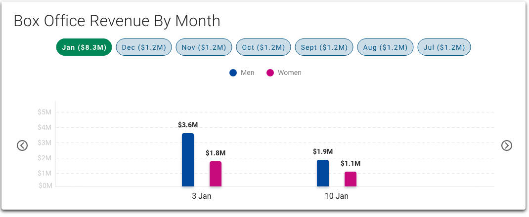
With groups and time period filters
- not selected.
- not included.
- not included.
- not included.
- included.
- selected.
- selected.
- selected.
- selected.
- not selected.
- not selected.
- not included.
- not included.
- not selected.
- set to Group.
- not included.
- :
- selected.
- set to month.
- included.
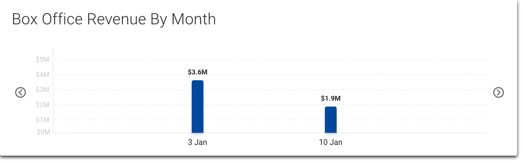
Without time period filters
- not selected.
- not included.
- not included.
- not included.
- included.
- selected.
- selected.
- selected.
- not selected.
- not selected.
- not selected.
- not included.
- not included.
- not included.
- set to Group.
- not included.
- :
- not selected.
- not included.
- not included.


