Bar Chart
Bar Charts display a single series of data represented by horizontal bars. The data represented can also be categorized by color to represent relationships between similar data values.
- Usage
- Configuration
- Examples
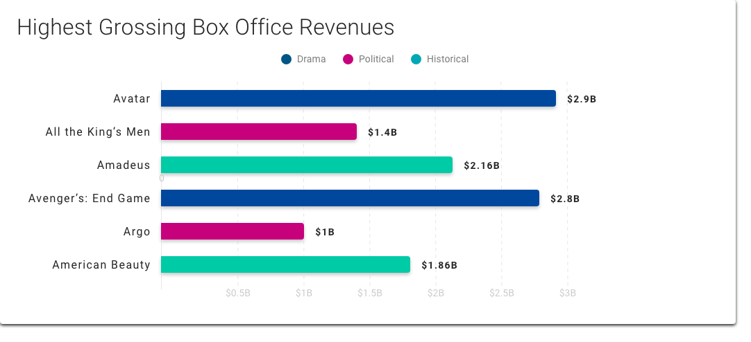
The Bar Chart is the simplest chart available and is generally used for displaying quantities of different objects or categories, such as in operational dashboards. While the Bar Chart is a flexible means of visualizing data, it's best used for representing one series of data or one series that can be divided into groups where the most important comparison is the quantity of each value (i.e. it's better to chart ticket sales of the top films during a given month than attempt to chart the ticket sales and the prices of those tickets).
 When visualizing change in a variable over time, consider using the Timeline Chart instead.
Anatomy
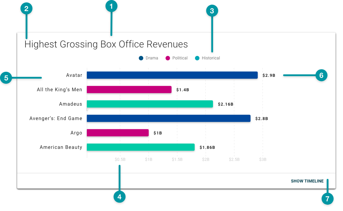
-
Card background
-
Chart title
-
Group legend
-
X-axis values
-
Y-axis values
-
Data value
-
Expansion button
Best practices
- Keep Bar Charts simple. Limit the number of variables and always make values for one axis numeric.
- Use TraceLink accessible colors. Be especially careful to avoid using any tone of red and green together, because people with certain types of color blindness cannot distinguish between them.
- Avoid re-using colors within a single chart unless those colors reflect the same data values or a relationship between those values. If you do re-use colors, include a legend.
- Use distinct colors to display comparative data (i.e. when you're comparing different data points).
- Bar Charts should predominantly be used horizontally (i.e. with the bars originating on the y axis and moving across the x axis.
- Configure Bar Charts as extra large components, and no smaller than small, on the grid, and keep in mind that the smaller a chart is configured, the denser the data will display.
-
Include a title, except when the component is positioned directly beneath a Screen Header or Section Header that provides an appropriate title.
- If pairing a Bar Chart with another component on the same row, provide a title for each component.
Common patterns
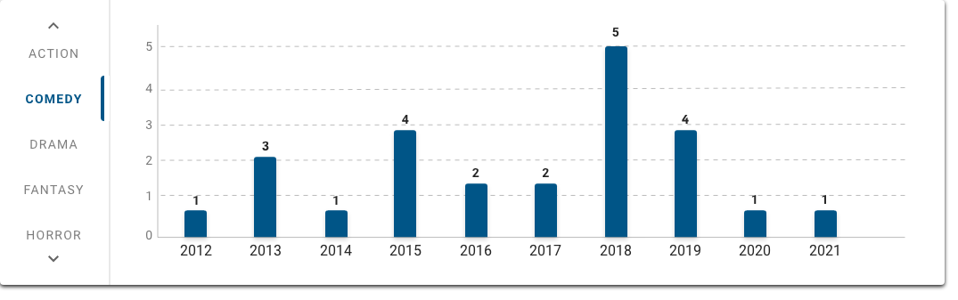
With Vertical Tabs
Vertical Tabs allow users to switch between different views of the same chart when paired with a Bar Chart. See how the genre tabs display different data from the same data source in the images below. This pattern is particularly useful when there are enough objects that a legend would be impractical.

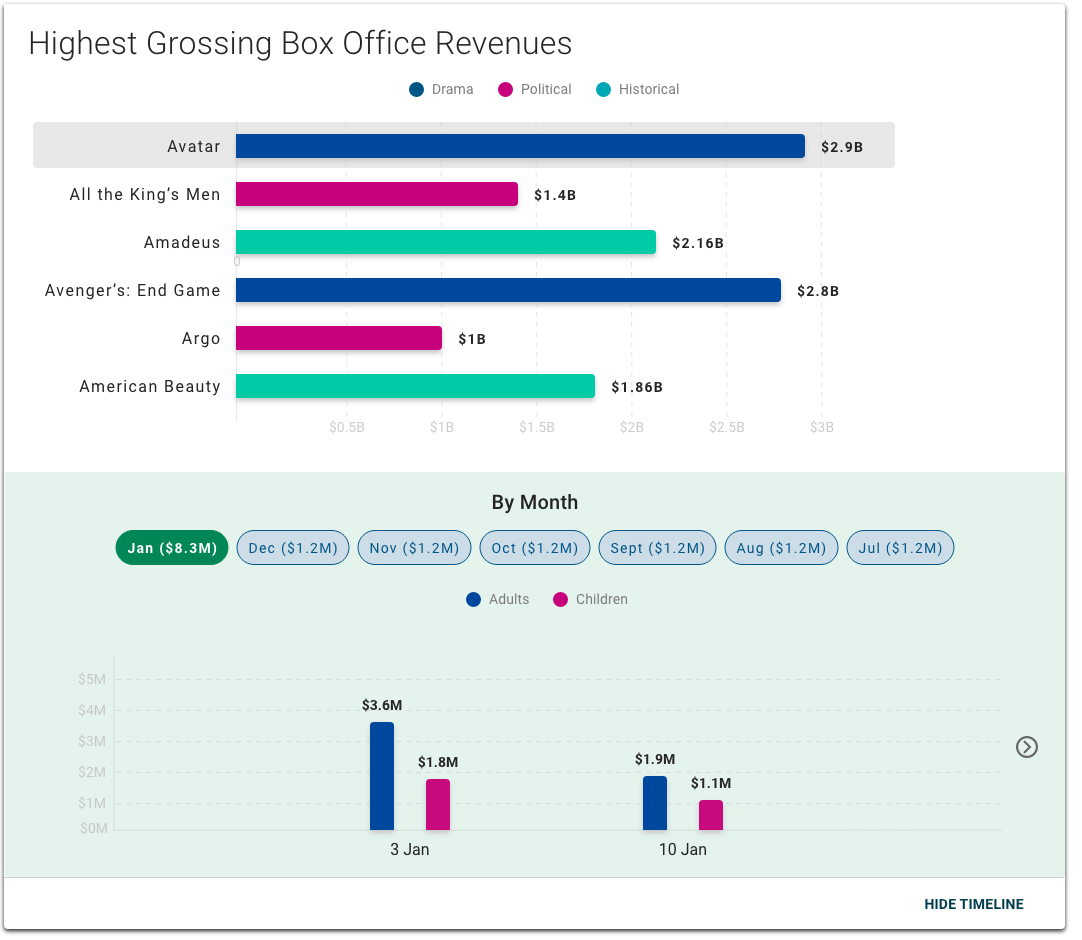
With Timeline Chart
Timeline Charts are often incorporated into the Bar Chart expansion, which can show the selected variable or data point over time. For example, a user could select a movie title in the Bar Chart and see in the Timeline Chart a breakdown of ticket sales by gender over different time periods.
Properties
-
checkbox – Optional. If selected, a card background is applied to the chart, which sets the component apart from the screen background. If not selected, the default background displays.
-
field – Optional. The hex code for the bar chart background color.
-
field – Required. The query that retrieves the data for the bar chart, including the and values, based on the data model.
-
field – Optional. A single expression using logical operators that determines when X values matching a specified condition are excluded from the chart (e.g.
x>10). -
field – Optional. A single expression using logical operators that determines when Y values matching that condition are excluded from the chart (e.g.
y>10). -
field – Optional. The label that displays for the X-axis.
-
field – Optional. The label that displays for the Y-axis.
-
checkbox – Optional. If selected, the X-axis values are displayed diagonally. If not selected, the X-axis values are displayed horizontally.
-
checkbox – Optional. If selected, the bars in the chart are categorized by color using the colors defined in and the labels retrieved in .
-
checkbox – Optional. If selected, and or is selected, group labels display as legends above the chart data.
-
field – Conditionally required if is selected. The query that retrieves the data for the group labels and corresponding X-axis values.
-
section – Conditionally required if is selected. A section of properties used to configure the labels and colors that display for the data group:
- field – Optional. The label that displays for the data group, retrieved from the .
- field – Optional. The hex code for the group label text.
- field – Conditionally required if or is not selected. The hex code for the bars in the chart.
- field – Optional. The title that displays for the chart.
- drop-down – Optional. Specifies the orientation of the chart:
- Vertical – (default) The chart is oriented vertically.
- Horizontal – The chart is oriented horizontally.
- checkbox – Optional. If selected, a menu displays when a user selects a data point.
- field – Conditionally required if is selected. The label that displays for the menu when selected by the user.
- checkbox – Optional. If selected, grid lines display on the chart.
- checkbox – Optional. If selected, values display on each data point. If not selected, data values only display when the user hovers over a data point.
- checkbox – Optional. If selected, a filter for users to filter chart data displays.
- field – Conditionally required if is selected. The query that retrieves the fields used to filter the chart data.
- checkbox – Optional. If selected, users can collapse and expand the chart.
- checkbox – Optional. If selected, the chart displays as collapsed when the screen loads.
- field – Optional. The label that displays as the button to expand and collapse the chart.
- checkbox – Optional. If selected, an Expand icon displays next to the button.
- checkbox – Optional. If selected, users can expand the chart to view additional information.
- checkbox – Optional. If selected, a pop-up containing the relevant data value displays when a user selects a data point.
- checkbox – Optional. If selected, the chart is paginated if the content exceeds the available screen space.
-
field – Optional. The maximum number of values to display per page.
-
checkbox – Optional. If selected, X-axis values display directly beside the data plot point. If not selected, X-axis values display as a label along the X-axis.
-
field – Optional. The hex code for all groups not specified in .
- checkbox – Optional. If selected, Y-axis values of zero do not display.
- checkbox – Optional. If selected, X-axis values of zero do not display.
- checkbox – Optional. If selected, when a user selects a data point, relevant context-sensitive information in other parts of the screen reflects that current selection.
- checkbox – Optional. If selected, multi-series data sources can be queried in , and the series are grouped by category in the chart. If is selected, cannot be selected. Bar Charts can use data groups or multi-series data, but not both.
-
section – Conditionally required if is selected. A section of properties used to configure each series within the multi-series data source:
- field – Optional. The label that displays for a series within the multi-series data source.
- field – Optional. The hex code for a series label text within the multi-series data source.
- field – Required. The query that retrieves the data for a series within the multi-series data source, based on the data model.
All series in the multi-series data source must use the same index. If the multi-series data source uses multiple indexes, the chart is not rendered.
- Hide – The component is hidden.
- Disable – The component is visible but not cannot be interacted with.
Emitted Events
- – The user selects a data point.
- – The user selects a menu item.
- – The user selects the additional info icon.
- – The user applies a filter.
Functions
- – When invoked in an event, defines and applies additional conditions to the beyond the default.
- – When invoked in an event, the chart updates.
- – When invoked in an event, the X-axis value and Y-axis value are retrieved.
- – When invoked in an event, the current selected filters are applied.
- – When invoked in an event, returns all current selected filters.
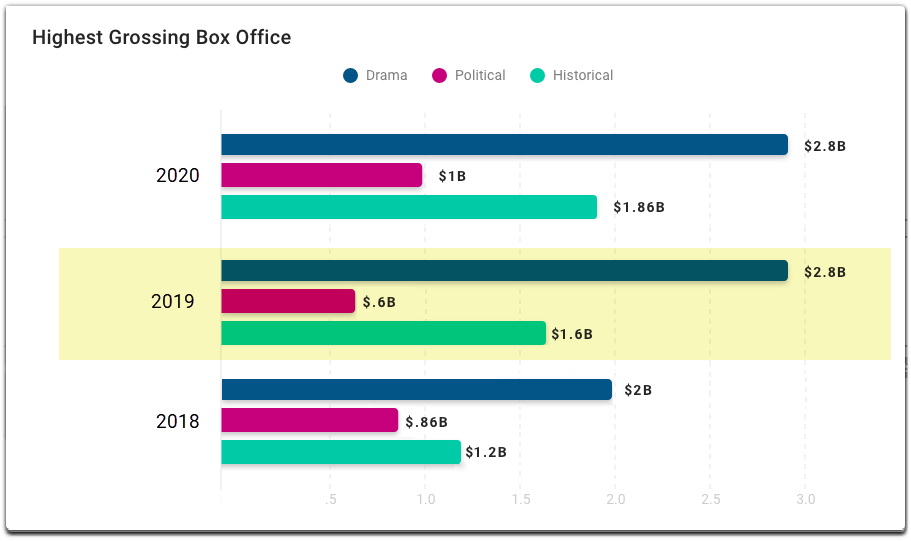
With groups
- selected.
- selected.
- included.
- :
- included.
- included.
- included.
- set to Horizontal.
- selected.
- selected.
- not selected.
With multi-series data, category selected
- not selected.
- selected.
- included.
- set to Horizontal.
- selected.
- selected.
- selected.
- :
- included.
- included.
- included.
- selected.
With title, in vertical orientation
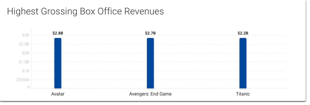
- not selected.
- included.
- included.
- set to Vertical.
- selected.
Horizontal orientation
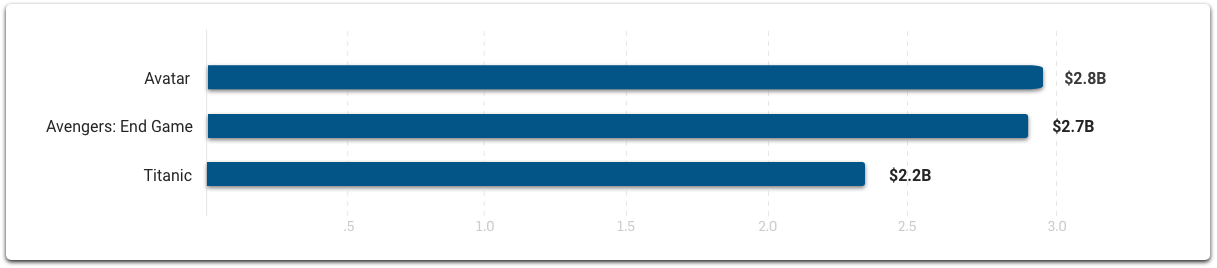
- not selected.
- included.
- not included.
- set to Horizontal.
- selected.
- selected.


