Screen flows
Define the order that users move between screens in the content area to achieve common flows. Consider using a wire flow diagram to help decide the best way for the screens to flow together before building the screens and flows in Customize.
Core screen flow
Use the core screen flow for screens that users access by selecting an item in the side menu (e.g. an experience task below Do).
 Follow navigation best practices to determine which menu items you need. Also consider the options that users must select in the Network, Team, and Process drop-downs (i.e. the network context) to understand how they will arrive at the menu items.
Landing experience
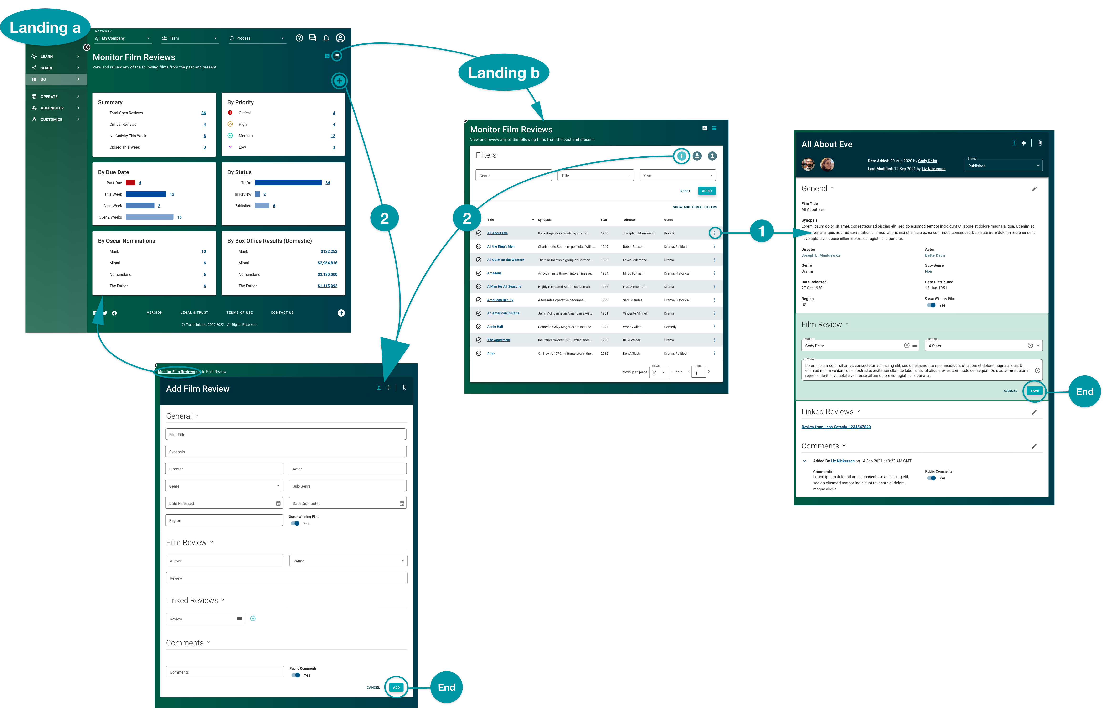
After selecting an item in the side menu, the content area should allow the user to land and understand the most important information for that task. Use a standard screen to provide the information as a dashboard and as a table, and include action icons that allow users to switch between views.

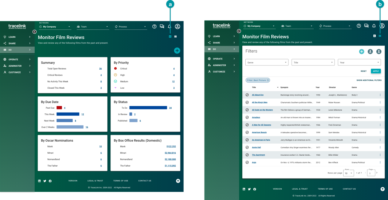
- Dashboard view: Charts and indicators visually represent the most important data, allowing users to quickly spot critical information and detect trends that might be difficult to see in the table view. For example, the dashboard view could show film reviews with specific due dates or priority. The dashboard view should be the first thing users see after selecting the side menu item.
- Table view: A table with filters exposes all data and allows users to filter for specific data. For example, the table view could provide a complete list of all film reviews that have been added.
Best practices
- A single side menu item can lead to multiple screens that the user navigates to from the landing experience. From the landing experience, lead the user to additional screens within the content area if it will help the user complete their intent.
- In Customize, build the landing experience using two screens: one screen for the dashboard view, and another screen for the table view. The user interprets the landing experience as if it were one screen, although it is functionally two screens in Customize. See the Customize Help Center for more information.
- For the dashboard view, use a standard screen with the operations dashboard or analytics dashboard layout. For the table view, use a standard screen with the results table layout.
- Use the same text on the dashboard and table views for the title and subtitle in the Screen Header. Using the same title and subtitle in both places makes the landing experience seem like one screen.
- Provide the same actions in both the dashboard and table views to allow users to easily continue with their flow from either place.
Path 1: View details
From the landing experience, provide users with a path to view additional details about the information in the dashboard and table views. For example, provide users with an option to view more information about a row in the table view.
Best practices
- In the dashboard view, provide users with the ability to select each chart and view the chart's data as rows in the table view.
- In either the dashboard or table view, use a panel screen type with the quick view layout to present a few pieces of extra information related to what is on the screen. From the panel, direct the user to a standard screen that displays all information.
Path 2: Take an action
From the landing experience, provide users with a path to take action on the information in the dashboard and table views. For example, provide users with the ability to add new items related to the experience task.
Best practices
- Use components in the content area for actions, rather than putting actions in a separate side menu item.
- Position action icons in the upper right of the content area so that they are easily visible.
- After the user completes an action, display a banner message to confirm whether the action was successful. Use appropriate colors and language to describe the outcome of the action.
- Direct the user to the most useful next step after completing an action. For example, after a user adds something, show them what they just added.
- Use a panel screen type with the action layout for actions that have fewer than 7 steps. Use a standard screen type for actions that have more than 7 steps. Use a dialog screen type as a confirmation for significant actions (e.g. actions that can't be undone).


