Filter Panel
Filter Panels allow users to filter the data on the screen by specific attributes for the type of data displayed on the screen.
- Usage
- Configuration
- Examples
The Filter Panel provides a flexible way for users to filter and refine search results from large sets of data that come from a single source. In contrast with Facets, which group data by high-level category, the Filter Panel allows users to select criteria and refine data at a more granular level.
There are various use cases for the Filter Panel, the most common being alongside the Table View and charts.
 The availability of additional filters may vary depending on what's provided in the data model.
Anatomy
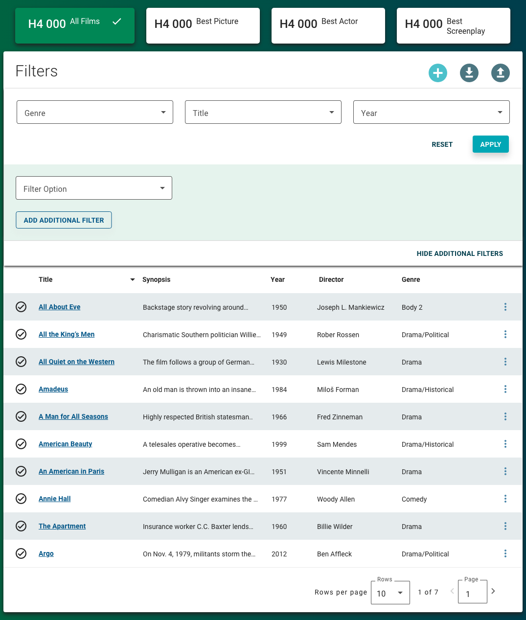
Filter Panel with Additional Filters hidden

-
Card background
-
Title
-
Filters that are always available
-
Filter buttons
-
Additional filter expansion button
-
Filter chip (applied)
Filter Panel with Additional Filters displayed

-
Card background
-
Title
-
Always-available filters
-
Filter actions
-
Additional filter
-
Additional filter collapse button
Best practices
- Configure the Filter Panel at the same size as the component whose data it's filtering (e.g. if used with a Table View set to extra large, Filter Panel should also be size extra large).
- Do not configure the Filter Panel below medium.
- Combine the Filter Panel with Facets to provide data filtering across multiple dimensions.
- Ensure the 3 always-available filters are the most helpful for users' needs.
- When combining the Filter Panel with Facets, position the Filter Panel beneath the Facets and above the content that's being filtered.
- If you're using a keyword as filter criteria, position that keyword as the first field; if you're using a status as filter criteria, position that status as the second field.
- If you only need a keyword search for a chart, configure that chart to allow filtering using the chart properties. The Filter Panel is best for filtering multiple charts on the same screen using the same criteria (which may be more complex or granular than a simple keyword).
Common patterns
With Facets and Table View
The Filter Panel and Facets complement each other and provide multiple dimensions across which users can filter and view data—usually in the Table View. Facets can bucket data into larger categories while the Filter Panel allows more refined filtering.
If a Facet is selected, additional filter criteria applied to the data will continue to read only through that Facet. Any additional filter criteria are querying against that facet.
Properties
- field – Required. The query that retrieves the data for the filter panel, based on the data model, including attributes and relevant data types.
- section – Required. A section of properties used to configure the filter:
- field – Required. The field name to filter for.
- field – Optional. The label that displays on the screen.
- field – Optional. The default value to filter for.
- field – Optional. The way in which the results must match the filter. This value is set to LIKE for this release.
- checkbox – Optional. If selected, the user inputs filter values using the default input type, based on the data model. If not selected, the Solution Developer specifies the input type using .
- drop-down – Optional. The input used to enter the values for the filter field, if not opting to use the default input type:
- Period Range Input Treatment – The user inputs a date range.
- Type-ahead Input Treatment – The user can search for and select a value from an auto-populated list.
- Available Values Input Treatment – The user can select from the available values, which include the number of filtered results for each value.
- checkbox – Optional. If selected, the filter panel is set as read-only and cannot be edited by the user.
- field – Optional. The source of the information to display when the filter panel is set as read-only.
- field – Optional. A list of filters that always display.
- drop-down – Optional. Specifies whether users can filter by category. If Filter by Category is selected, a sub-set of filters pertaining only to the selected category display, for which users can provide values to filter:
- Filter by Category – Users can filter by category.
- Make All Available – (default) Users cannot filter by category, and all filters display.
- section – Optional. A section of properties used to configure the additional categories users can filter by if is set to Filter by Category:
field – The label for the category.
section – A section of fields and their properties that the category filters against:
- field – The field that the category filters against.
checkbox – If selected, a value must be provided to apply the filter.
- section – Optional. A section of filter option groups in which related filters can be configured to display together:
- field – The label for the filter option group that displays on the screen.
- drop-down – The list of filters that belong to the group.
- field – Optional. The user's permission to access the component. If a user is not assigned a role that includes this permission, they cannot view or interact with the component.
- drop-down – Optional. If the user does not have permission to access the component, specifies whether to hide or disable it:
- Hide – The component is hidden.
- Disable – The component is visible but not cannot be interacted with.
Emitted events
- – The user applies a filter.
- – The user resets a filter.
Functions
- – When invoked in an event, the current selected filters are applied.
- – When invoked in an event, all filters are cleared and reset to their defaults, if applicable.
- – When invoked in an event, returns all current selected filters.
With additional filters

- selected.
- not selected.
- is set to Filter by Category.
Without additional filters

- selected.
- not selected.
- is set to Make All Available.


