Summary Chart
Summary Charts present a generally small set of simple data in a bar chart or table, prioritizing scannability over detail and providing a high-level view of a given data set.
- Usage
- Configuration
- Examples
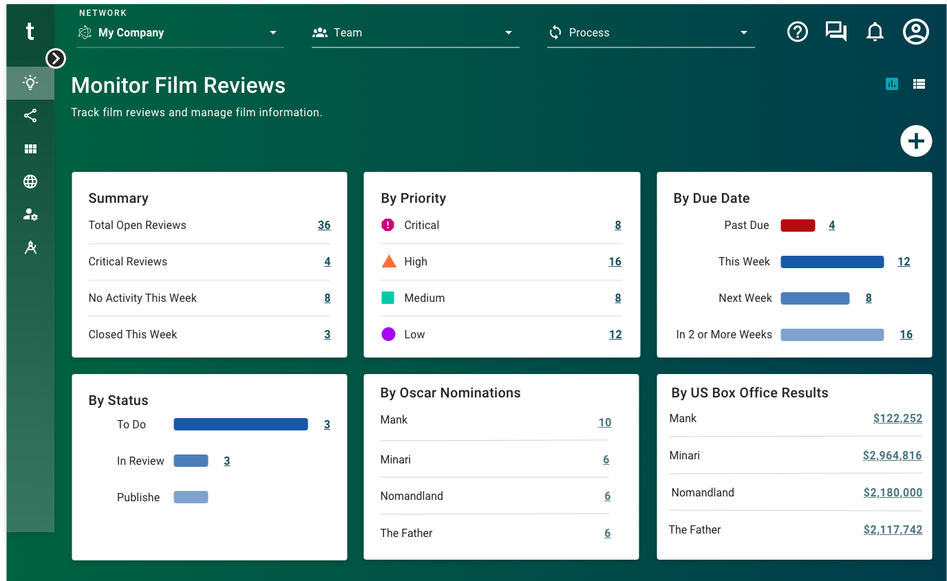
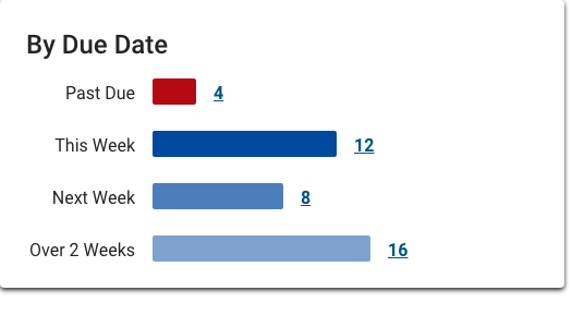
The Summary Chart visualizes high-level data with relatively few values. Summary Charts are most commonly used on visibility dashboards to provide a high-level view of data from a single source. They prioritize a wider view into a data set over a narrower, more detailed view in a way that's helpful for monitoring complex processes. Summary data is defined by specific search criteria and can display as links, allowing users to dive deeper into the pre-filtered results (e.g. film reviews due in over 2 weeks).
Anatomy
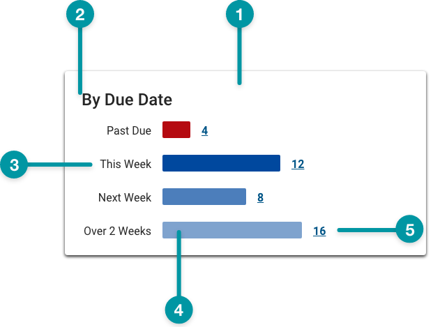
-
Card background
-
Chart title
-
Data label
-
Bar
-
Quantity
Best practices
- Use the Summary Chart to show users a particular attribute that's small enough to notice change, but not so small as to warrant a more granular chart. For example, a status of "on time" or "late" would be more useful for tracking a weekly filming schedule compared to a status of "shooting," which is too vague.
- Use TraceLink accessible colors. Be especially careful to avoid using any tone of red and green together, because people with certain types of color blindness cannot distinguish between them.
- If a series is intended to show a monetary gain or similar positive increase, use Emerald. Conversely, if a series is intended to show monetary loss or negative decrease, use TraceLink Red.
- Configure Summary Charts no smaller than medium on the grid.
- If pairing a Summary Chart with another component on the same row, provide a title for each component.
Common patterns
On visibility dashboards
Summary Charts are primarily used on dashboards and can be combined with other components to provide varied views of a given process or data set.
With Section Header
Especially when used on dashboards, Section Headers can help contextualize the data displayed in a Summary Chart within the larger screen.

Properties
- field – Required. The query that retrieves the data for the summary chart, based on the data model.
- field – Required. The title that displays for the summary chart.
- field – Optional. The hex code for the title text color.
- field – Optional. The hex code for the value link color. This property is only available if the checkbox is selected.
- field – Optional. The hex code for the label text color.
- checkbox – Optional. If selected, a card background is applied to the screen section, which sets the component apart from the screen background. If not selected, the default screen background displays.
- field – Optional. The hex code for the summary chart background color.
- field – Optional. The number of data points to display in the chart.
- checkbox – Optional. If selected, the chart is paginated if the content exceeds the available screen space.
- field – Optional. The maximum number of pages to display.
- drop-down – Required. Specifies how to display the chart data:
- Bar Chart Display Treatment – The data displays in a bar chart.
- Table Display Treatment – The data displays in a table.
- section – Optional. A section of properties used to configure which screens the actions link to:
- field – Optional. The screen that displays when users select the link.
- field – Optional. The filters to apply to the linked screen (e.g. the filters to apply to a table view screen to display as expected).
- section – Optional. Custom labels and values for testing purposes (e.g. Solution Developers can input sample labels and values to test the summary chart if no data exists yet to populate the chart).
- field – Optional. The user's permission to access the component. If a user is not assigned a role that includes this permission, they cannot view or interact with the component.
- drop-down – Optional. If the user does not have permission to access the component, specifies whether to hide or disable it:
- Hide – The component is hidden.
- Disable – The component is visible but not cannot be interacted with.
With bar chart display
- included.
- not included.
- included.
- set to Bar Chart Display Treatment.
- :
- included.
With table display

- included.
- not included.
- included.
- set to Table Display Treatment.
- :
- included.


